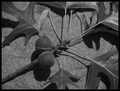
The whole impression, to me, is of a busy image with no obvious place for the eye to settle. The pinecone should be the focal point but does not really stand out and it is too central in the frame
I think concentrating more on the cone by using portrait format rather than landscape would have been better but also taking a further look around where you were and trying to find a cone with much less going on around it would really have helped this shot.
Technicals:
As your comments have suggested the image is way over saturated and this is the biggest problem I feel you have and the reason for you sub 5 score. Most of the detail has been lost on the pinecone and the overall image has a very unnatural feel to it.
I would suggest that if time allowed you tried to return to the area when the light was better as this would have prevented you from having to try and make the colours 'pop'. Failing the opportunity to return, a tighter crop and much less saturation may have worked better.
If you've got any questions about this critique, please feel free to contact me via the PM system.
The greens look oversaturated on my monitor. Hard to get detail out, it all blurs into one big poison green mass. Something to either let the seed pop out more or make the background less busy would have helped. In my opinion anyway.
I think a less-centered composition would help add interest to this shot. Check out the winning photos in the recent Rule of Thirds challenge to see what I mean.






 Add photograph to your favorites
 Add photographer to your favorites

 Photographer found comment helpful.


