Hello from the Critique Club,
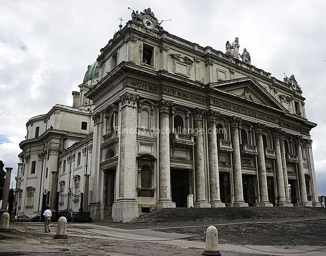
One would think from the comments that your received during the challenge that your score should be much higher than it is. However, the leading lines in your image (the building columns) are part of the main subject (the building) and therefore, cannot lead the viewer's eyes to the main subject. In this challenge the voter expected the leading lines to draw their eyes to a main focus point in the image. Your photo really doesn't have that element and your score suffered because of that.
On the technical side, your image is wonderful to look at and I love the delicacy of the colors. It almost looks like it was desaturated, which accentuates the stone in the building very nicely.
Feel free to PM me if you have any questions regarding this critique.
Tim
|







 Add photograph to your favorites
 Add photographer to your favorites

 Photographer found comment helpful.


