I am new to this, however I have an understanding of how to set most settings on the Powershot 200 but I can't figure out the aperture setting. Could you enlighten me. I hope I am not being disrespectful and asking this in the wrong place. I like your picture as well, however I'm really not qualified yet to comment on it. Thank you.
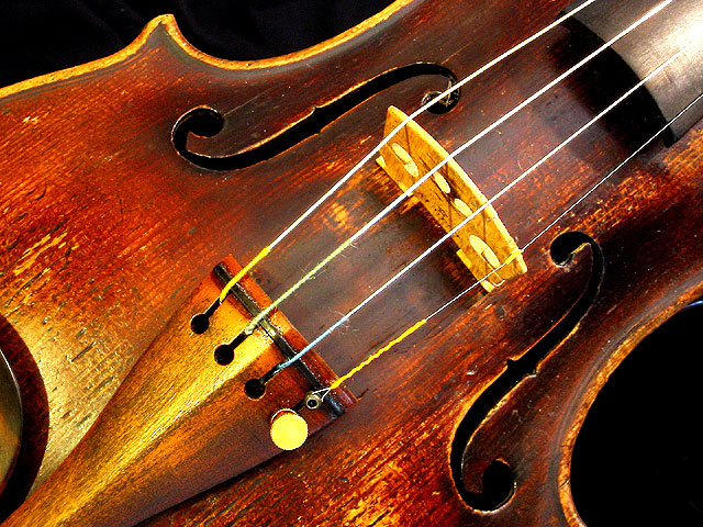
This image has several elements that I find appealing. First and foremost is wood....I love earthy elements like wood and pottery. The wood here is nicely grained and has nice warm tones. Curves are another element I savor and curves are abundant here. The third aspect I like is the diagonal angle. Add all that to my love of music, which this represents so well, and the cropping is good. I like the dark/black background. Lovely picture, uncluttered...wonderful job!
great composition. I like the curves in the image contrasted with the straight lines of the strings. it looksl ike you may have cranked up the saturation in the shot. if you did, then perhaps you should reconsider. I think the natural colors in the violin could carry the image, and the muted colors might perhaps enhance the feeling of age.
great photo, i only wish the strings weren't so bright...they're blinding! the composition, though, is fabulous. ~mcmurma Aesthetics...8 Meets Challenge...8 Overall...8
I like this photo very much, especially the colors. Good focus, DOF and composition, too. Only the lighting is a little strange. The areas in the middle under the strings are too white and the gleam in the top right corner is a little too hot in contrast to the rest of the photo. But still a beatiful photo! - stephan
I love the overly yellow tones and the angle and composition. Works much better than it would have done had you included the whole violin. The patina of the wood and all the wear and tear comes through wonderfully. This is the kind of thing I'd buy on a postcard.
wow... this is a BEAUTIFUL instrument... you have done an excellent job on this photo... This makes me want to listen to the Paganini Caprici for voilin :) - great shot... - jmsetzler
This is a beautiful shot! It seems to me to be a bit overly red, but I like it that way. The framing is just right. The flare on the fret board is a bit distracting, but not enough to score you down for. I keep seeing little things about this that don't look good. The lower hole (don't know the tech name for it) in the violin, the upper section of the hole blends in with the shadow. Sorry, but too many tiny issues to leave this as a 10 (but I want to anyway), I am going to place you at a 9 with lots of plus signs (nearly a 10). Swash
I think this is a very nice photo. I love the fact that you can see the texture/grain of the wood. Very nice composition and angle. Perhaps just a touch too much contrast/sharpening (could very well be me, though). Great work!!! 9 Ruthann
The lighting and close up shot of this violin certainly fits the criteria for the challenge. This shot is gorgeous, and different from the cliche shots. Great work!
Something old. Use your photographic technique to emphasize the age of your subject. Composition - very good Technical Aspects - quite good Meets Challenge - yes Visual Impact / Originality - good
i like the framing and the clarity/color of this photo--it really shows the age of this beautiful old violin. the only nit-pic i have are the bright lighing on the neck (perhaps a diffuser or different placement of the light?) otherwise, very nice job! 8--amitchell






 Add photograph to your favorites
 Add photographer to your favorites


 Photographer found comment helpful.


