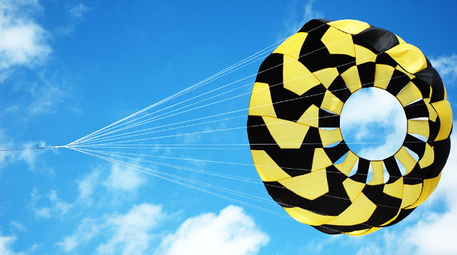
Taken at a kite festival. Loved the way the kite strings were attached to the parachute and the black/yellow against the blue sky. I think this is my best challenge entry yet.
Statistics
Place: 67 out of 294 Avg (all users): 5.7778 Avg (commenters): 7.1667 Avg (participants): 5.6104 Avg (non-participants): 5.8929 Views since voting: 1463 Views during voting: 271 Votes: 189 Comments: 15 Favorites: 0
Congrats on your personal best. I do agree with the crop at the junction point as well. It would be a kick ass optical illusion if you did!
You've come a long way since Frosty's Little Brother ;-)
Lighting, contrast, color, brightness hue, and saturation are all excellent.
Focus is lazer sharp, and depth of field is fine.
I like the colors, the contrast of the sky against the kite.
My only complaint, and maybe my eyes are just backwards, is that my eyes follow the lines away from the kite to to pint where they converge, and then off the page to the left. The kite plays optical tricks. At first, and at times it looks like you are viewing the kite from behind. Then you notice the lines continue into the kite and you are actually seeing the inside or front of the kite.
When seen as from outside or behind the kite, the distraction is extremely strong. When seen as inside or in front of the kite, the effect is still there, but not as strong. Even from the front my eyes as they follow the expanding strings, tend to want to slide back down to the junction of the strings and away from the subject.
Great job! Excellent score and placement on this one - and it's a great shot, too! I do like the lines, and really like the color play of the yellow/black against the blue. While I'm sure the camera helped some, it's a whole lot of you just seeing things well and capturing them. :-)
I did not have time to participate in the voting of the challenge but I saw the thread and had a look see at your entry. First off the very bold colors and patterns of the kite really grab hold of the attention. Color clarity is wonderful. But once a viewer gets past the bold color and patterns is there anything else to the composition to hold the attention? In my opinion (others will differ), I don't think it does. But it does have potential. Your companion/competitor who took a similiar shot had an element of composition that played well with the title of the piece. "Tethered" had the crop come right up to the where the lines of the kite met AND it had them meet in the bottom left hand corner of the composition. Your crop has too much of the single string that meets up with the joined ones. I think a closer crop to that meeting point would improve the composition because it is one element that does not help strengthen the composition. The first look at your image I had this mental image of a great big eye - matter of fact with those leading lines that spread out from the kite to meet at a point made me think of those diagrams one had had to do in health class when learning about the parts of the eye and it's function. Hmmm, that concept could possibly help your composition if you titled it with something refering to an eye - that would have been yet another hook for viewer's to stop and take a longer look - showing/telling the viewer yet another way to look at something. I don't know if the next suggestion is feasible or not but perhaps if there was something else that could have been captured in the frame off to the right that the 'eye' could look at. For example, a bird, a plane, etc. - but not something so big that it would detract attention away from your main focus. One other thought on composition, if it were possible, would be to have this kite on the left hand side 'looking' to the right and another similiar kite on the right hand side 'looking' to the left such that they appear to be 'staring' at each other.





 Add photograph to your favorites
 Add photographer to your favorites

 Photographer found comment helpful.


