just saw this image ;) nice work, the fence is awesome for balancing this image. I have to visit Smoky Mountains one of these days.... looks like a gorgeous place.
Yea, Cades Cove!!! I thought that's where it was, but I was afraid of sounding like an idiot. I wanted to get out there, too, but just couldn't get the time!!
The camera was set to high contrast and high sharpness which probably isn't the best choice for tightly packed lines like this. I checked the original and it has the same problem so I don't think I sharpened much if any. This was just one of about a hundred shots that I took in the park that day so I didn't overthink it. I was actually just going around wishing I had a zoom attachment because there were a lot of animals out - even a bear and cubs. I think they liked the cloudy weather. It was really windy and threatening to rain. That was part of the problem with the sky. It was about 7:30pm and getting so dark under the trees that I had to overexpose the sky to show the house.
I'm happy for you with your excellent score. This is a fine picture and you have reason to be proud. I will tell you what happened to me on this picture. In my first complete round of voting this one was my top pick. I had given it a nine with the idea to make it a 10 when tweaking the vote. When I saw it again lateron in the week, I was really bothered by the lines on the building. It seemed as if the image had been oversharpened. I would like to hear from you whether that was the case. Then I turned the picture into an 8. Sorry :). Anyway, great picture!!! I do think the fence and the colors and the whole setting is just wonderful. My advice: shoot what feels right to YOU. As you well know, one gets a bunch of totally contradictory opinions. So what?!
YAY! I broke the top 5 :o) Comments are really interesting. Someone will love the fence and other will find it distracting. One person will like the colors and another will think they're too bright. Someone likes the lighting and someone else thinks it needs a filter. There is obviously not a concensus on what makes a good picture. I do agree on the composition comments, but the scene isn't perfect in real life either. Just off the bottom of the pic is a paved road. To the left is the opening in the fence, trees, and a covered structure. There really isn't a better place to photograph this cabin from the front. As for the grass...it's those pesky park service people who went and mowed it. ;oP
The colors in this shot are absolutely beautiful. I also _love_ the angle and framing you've chosen, especially with the fence winding across the bottom of the image. Great contrast. Great textures. 8.
Something old. Use your photographic technique to emphasize the age of your subject. Composition - good. Did you try a vertical crop to remove tree on right and focus on house? Technical Aspects - quite good Meets Challenge - yes Visual Impact / Originality - pretty good
This is a beautiful shot, my compliments to the photographer, but it doesn't really accentuate the AGE of the building. I mean, it looks old, but not that old. Love the fence, though.
A splendid image. The green is very commanding. The contrast between the green and the structure's earthy tones is brilliant too. Overwhelming resolution too.
After the competition, it may merit cropping the top of the image down a bit to eliminate the open sky portion. The photograph may be more powerful and it may further enhance an already vivid image. Superior work, thank you for submitting it.
Love the bright, lush colors. The fence effectively pulls my eye into the photo and frames it nicely, the angle of the house gives it depth...even though it's old, it is still welcoming! Nice work.
This is a beautiful setting! (Seems a little overly green, is that just me?) Nice job! (needed a break from commenting the 6's) I can't think of any suggestions to improve this shot, so I'm raising your score from a 9 (first impression was very good!) to a 10 (lasting impression equally good or better!) Swash
I cant help feeling that this would be better with the houuse in the top right of the frame, bringing in the fence as a compositional element. Nice colours.
This is a great shot. I like the fence – don't ask me why, I think it's a subliminal influence. It's great on the eye, makes the place inviting and friendly. The whole image has a hidden tranquillity; I can't help imaging myself sitting on that porch relaxing with a glass of wine… (10)
I realy like the greens and browns of this picture. I am not all that comfortable with the composition, in my opinion the main porch should be facing onto the picture and that would place the striking wood siding on the right third for a more pleasing composition.
This is beautiful work... the lighting is SUPERB. In my local camera club, this photo would get pounded because of the fence. These people in my club feel that a landscape photo needs a path or entrance for the viewer to walk into the scene. They feel that objects blocking that 'entrance' path are not a good thing... anyway.. that's them.. i don' t feel that way :) The mood of this photo makes me very comfortable... I can just imagine myself standing here on a cool mountain morning... about 65 degrees outside... I love this photo... it gets a 10 this week... good work :) - jmsetzler
I like your colors and the detail of the wood. I think it would seem more balanced if the house were in the right side of the frame instead of the left.
This is really nice. Greens are nicely sturated as are the reds in the wood of the house. The fence running through the foreground provides a nice break from the mostly green frame around the house.
I like it. Really nice colors; nice effect. It's good to see that you didn't go overboard on the sharpness, like some people will likely suggest. The fence in front is a bit distracting. (7).
Beautiful image; great composition and colors. Love how you cropped the fence; it gives wonderful rhythm to the image. Very peaceful and a delight to look at this image. Definitely will revisit this one lateron.





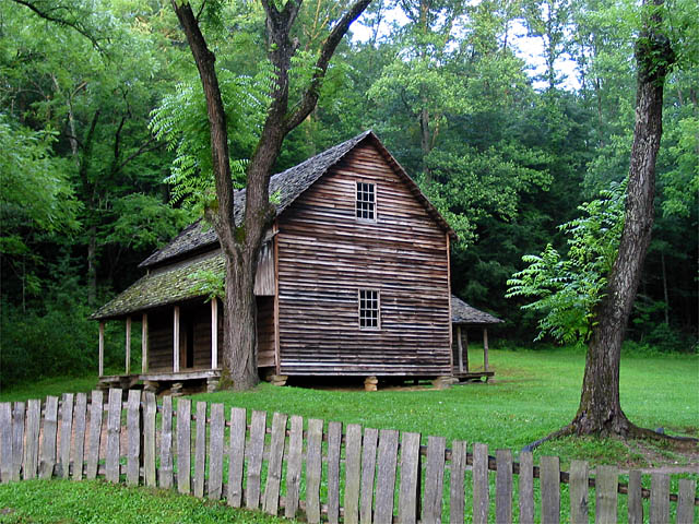
 The Tipton Place
 Add photograph to your favorites
 Add photographer to your favorites

 Photographer found comment helpful.


