| Author | Thread |
|
|
10/05/2006 10:15:31 AM |
Trading post...
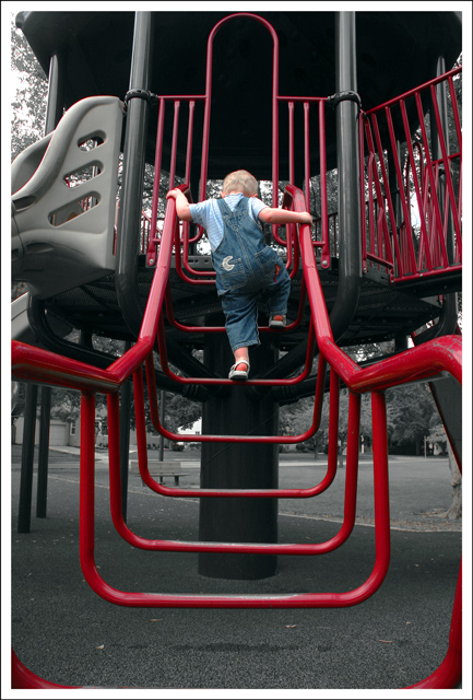
Nice lines! I don't really care for the selective desat. I didn't vote in this challenge but probably would have gone 5 or 6. While the lines intially lead you up to your daughter, the red after that pulls you to the side which seems to have some kind of weird tilt to it. |
|
 Photographer found comment helpful. Photographer found comment helpful. |
|
|
10/03/2006 06:49:40 PM |
|
Rowan this time! Not sure about the desat, but reading your explanation, I can understand why you did it. I don't mind "busy" when it serves a purpose, and it doesn't bother me here at all. In fact it serves as kind of a neat contrast - all the busy hard lines and and metal and plastic edges comtrasted with a lovely little girl and her concentration. |
|
| Photographer found comment helpful. |
|
|
09/28/2006 11:46:24 PM |
I see what you were going with on the selective desat, but I'm not sure it works. This is coming from a guy who likes selective desat (not everybody on the site does). A good example is the group of bars on the upper right. They don't help and the desat actually makes them worse.
I like what you were going for, but probably the setting was just too jumbled (which you sensed) for a great leading lines shot. The little man is quite cute though. I love overalls. |
|
| Photographer found comment helpful. |
|
|
09/28/2006 07:22:44 PM |
|
Glad not so many people agreed with me and that you got a decent score ;-) |
|
| Photographer found comment helpful. |
Comments Made During the Challenge  |
|
|
09/26/2006 11:21:47 PM |
|
| Photographer found comment helpful. |
|
|
09/24/2006 05:57:21 PM |
|
| Photographer found comment helpful. |
|
|
09/22/2006 03:10:53 PM |
|
| Photographer found comment helpful. |
|
|
09/21/2006 03:08:38 PM |
|
The red color and the subject made the shoot. Nice catch. |
|
| Photographer found comment helpful. |
|
|
09/21/2006 11:51:36 AM |
|
good composition. I'd love to see this as a black/white. |
|
| Photographer found comment helpful. |
|
|
09/20/2006 12:10:13 PM |
|
I wonder if this is basic editing? |
|
| Photographer found comment helpful. |
|
|
09/20/2006 10:29:31 AM |
|
The composition is very good and so is the subject. The desat effect cheapens the image and in playing to the gallery I think that you have lost much of beauty in it. I would have chosen black and white or duotone to present this. The frame works well. |
|
| Photographer found comment helpful. |
Theme:
Classic /
Light /
Dark
Home -
Challenges -
Community -
League -
Photos -
Cameras -
Lenses -
Learn -
Help -
Terms of Use -
Privacy -
Top ^
DPChallenge, and website content and design, Copyright © 2001-2026 Challenging Technologies, LLC.
All digital photo copyrights belong to the photographers and may not be used without permission.
Current Server Time: 10/18/2026 10:24:28 AM EDT.






 Add photograph to your favorites
 Add photographer to your favorites


