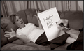
Hmmmmm.....was wondering what to do with something I shot for the School Days Geometry Challenge and this generated from that. I actually like it and it reminds me of a Larson cartoon very much. I was going to put a caption in but figured the sign in the background was enough. I hope. We'll see.
Post: Well. More On that later. I'll write it down but basically I used photocopy on a layer and Buzz Simplifier No.1 on a layer and merged them and this is what I got. To even the primary colors, I painted over the colors of the tissue paper in each of the section. Used Neatimage first, twice so the Buzz layer would work cause if the file is too large it does not take and errors out. Some minor clean up in areas around the frame. Used the liquify filter for the Dali effect. Used the rectangular marguee tool for the sign and paintbucket. Wrote the letters in with the pencil tool and then used the liquify filter on that as well. That's about all I remember.
Statistics
Place: 28 out of 80 Avg (all users): 6.2310 Avg (commenters): 7.5333 Avg (participants): 5.7258 Avg (non-participants): 6.3684 Views since voting: 2164 Views during voting: 748 Votes: 290 Comments: 16 Favorites: 2 (view)
BHA-HA-HA-HA! Great presentation in this composition. Warped and twisted is the concept conveyed as well as a reference to a lot of Dali's work which is a warped perspective. With all the colors and twisted shapes it almost appears as an abstract. Not sure if a color or B&W presentation would have been better. One critique I can offer is that I think that the caption should have been normal block letters or at least made a tad more legible in the skewed form.






 Add photograph to your favorites
 Add photographer to your favorites

 Photographer found comment helpful.


