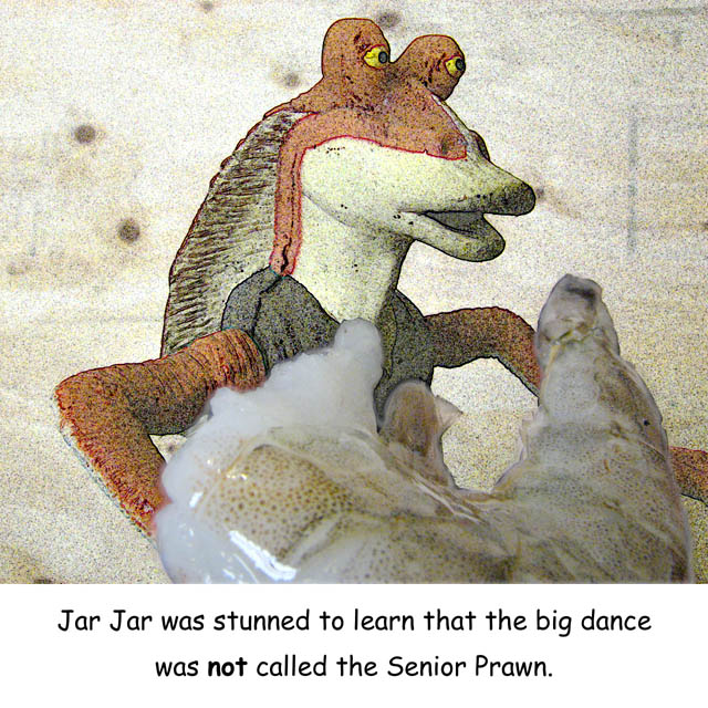
...which many people think would be an excellent idea -- especially if done permanently. What's really funny is I didn't even know he came from an underwater world until I had to research how to spell his name.
I wanted to do it with a T. rex, but all of my son's animal toys are in storage, and it helps with the caption to have a "named" figure.
-Jar Jar figurine and a shrimp, plywood in the BG
-Handheld, super-macro mode
-Window and fluorescent light
-RGB Curve
-Created mask for shrimp
-Invert and feather selection
-Find edges filter run on BG figure
-RGB curve on BG (through mask)
-Reduce opacity of filtered layer to 80%
-Invert selection
-RGB curve on the shrimp
-Clone/touch-up a couple of rough selections along the arm on the right
-Crop a bit from left
-Enlarge Canvas to square
-Caption Added
-Reduced for DPC
-USM at 16%/64 dia/TH = 0
-SaveAs JPEG at quality 5/10 = 130kb
Statistics
Place: 76 out of 80 Avg (all users): 4.8924 Avg (commenters): 5.5714 Avg (participants): 4.5667 Avg (non-participants): 4.9781 Views since voting: 2206 Views during voting: 844 Votes: 288 Comments: 12 Favorites: 0
I think this would have done much better if there wasn't as much PP. Jar Jar looks like he was drawn onto the wood background and not a figurine. I think if he would have been really crisp and clear, this would have done better.
Thanks for the comments!
Since this was a tribute to a cartoon, I felt it appropriate to try and give it a cartoony appearance, especially after I saw how bad the original looked (see below). I also wanted to add an element of unreality by having the shrimp obviously real.
If I had had more time available I would have looked for a better background than the wood, but I was quite rushed when I took this, I think in the last hour before submission time. I was originally going to do this with a T rex, but I couldn't find my son's toy dinosaur collection in time; Jar Jar was a compromise.
This is a great Larson-esque title and fits the photo quite well.
I think this would have done much better if there wasn't as much PP. Jar Jar looks like he was drawn onto the wood background and not a figurine. I think if he would have been really crisp and clear, this would have done better.
Also, the fact that this is obviously not a traditional Larson, probably hurt the voting.
Great job on the caption. :) I like the composition of the image, but it's just a little flat (needs some postprocessing?) and noisy; maybe way oversharpened.






 Add photograph to your favorites
 Add photographer to your favorites

 Photographer found comment helpful.


