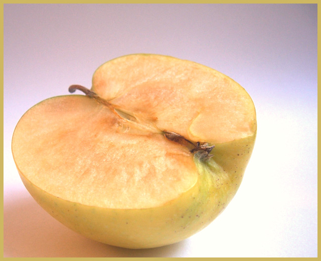
This idea came in to my mind very late on Sept 12th. I just had about 15mins. So I had to do a very quick job. I wish I had better lighting to get rid or the shadow.
Post Processing:
-Curves
-Brightness/Contrast
-Hue/Sat
-more Curves
-Cropped and resized
-Added Border and submitted
Statistics
Place: 61 out of 90 Avg (all users): 5.0925 Avg (commenters): 5.5000 Avg (participants): 4.7778 Avg (non-participants): 5.1367 Views since voting: 945 Views during voting: 401 Votes: 292 Comments: 18 Favorites: 0
Good concept, bad border!!! With borders like this one you actually take away from you photo subject and you draw the audience towards the border, never let the border speak for your photography. ;-) Just something I've learned
Thought the shot is focused and well taken, I find the whole thing rather blah. That being said, you definitely got your point across and should not be shot down for it. 6....good luck!
Very cool idea, the background is a little too light though which takes away from the apple and the focus seems slightly off, but great composition and again cool idea!
I think the border spoils the photo here. The colour choice on it was bad imo and its a major distraction. The apple also seems too close to the edge on the left and bottom.
I would have loved to have seen the whole face of the apple and the stem in focus. However, since this is a personal preference, I won't mark you down. The lighting and post processing are both well done. Bumping to a 8.





 Add photograph to your favorites
 Add photographer to your favorites


 Photographer found comment helpful.


