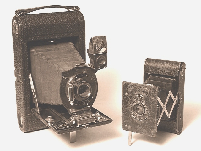
A good idea, and a nice shot of the cameras. my only suggestion would be to darken the image. it looks a tad overexposed right now, so you could fix that in post-processing or just redo the shot.
i love the idea for this challenge. you photo is nice, but lacks 'umph' in my opinion. i just tried to do some postprocessing (all i did was autolevels). that increased the contrast, and made your photo much more interesting to me. it also highlighted those shadows which are nice on the white background. let me know if you'd like me to send you a copy of what i did. -- gr8photos (5)
I wanna give this photo a good score for effort :) I think the composition here is exellent but it looks over exposed to me. Subjectively, this is an excellent photo... on the technical side, it needs some minor improvements. This image could possibly be adjusted with levels or contrast controls to make it have more punch :) - jmsetzler
ok, i'm having a tough time with this one. first--i love the picture--very nicely set up and also nice subject/composition. I'm just trying to figure out if it has the soft overexposed look on purpose? I can only assume so, to make it look older? it looks like you jacked the output levels way up to give it that oldtimey portrait look?I took the liberty of putting this in photoshop and messing with the levels--darkening the cameras and taking that whitish contrast off really makes the camera and shadows stand out really nicely. but like i said, that is just me--i still like what you have here! BTW, i've never left such a long comment so i'll stop! email me if i'm way off base because now i'm curious and would like to know your intent here! :-) 8--amitchell
Wow - someone's very lucky to have these knocking about! Superb subject. Well lit and focussed. Sepia tone doesnt detract from the image but it doesnt add much either. I think I'd have stayed with colour. Either way it's a lovely shot.
Well fit subject matter... but I would've preferred to see only one camera. Both fit the criteria and both are visually interesting but my eyes keep jumping from one to the other. To improve this shot I would've eliminated one object and moved in a bit closer on the chosen one to give it a tighter composition and an interesting depth of field. ... but that's just my 2 cents ... :-)
This is definately a well executed shot, technichally perfect as my untrained eye can see however it lacks much interest for me. Comes off as an advertisement rather than artistic for me. "Things of Grandma Brown, 1876 - 1966" while not as technical holds more interest and might be worth looking at. --8 Agamemnon
Don't care for the post processing. Gives the image a flat greyish look and the shadows are muddy and unreal. Composition is too static as well. Sorry.






 Add photograph to your favorites
 Add photographer to your favorites


