Well i couldnt remove the spots appearing in the spots without going out of challenge scope.So please dont crucify me for that........
Post processing:
Contrast:20
Curves
Hue sat
Selective color
Color balance
Neat Image
Usm
Post:
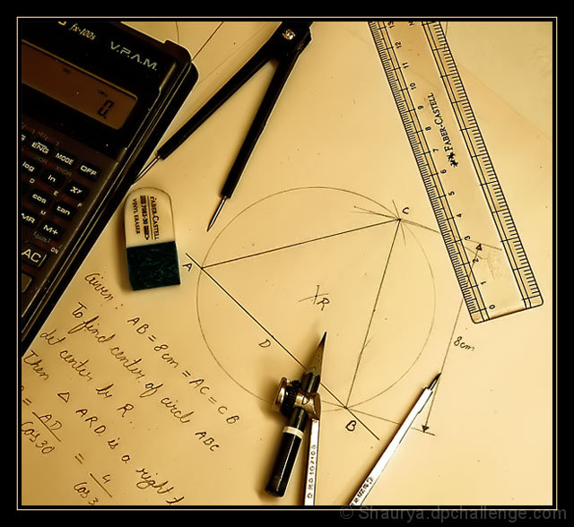
Well most of the comments relate long ago to calculator.
1> Calculators have been there for quite some time.
2>I have tried to show long ago form my point of view......well it used to be geometry for me 6 years ago.....well it seems long ago to me :P
Statistics
Place: 14 out of 182 Avg (all users): 6.2108 Avg (commenters): 7.2500 Avg (participants): 5.8103 Avg (non-participants): 6.4259 Views since voting: 1789 Views during voting: 250 Votes: 166 Comments: 18 Favorites: 0
This is a wonderful image! I love the tones and lighting - definitely gives it a vintage feel. The composition is very good, too - nicely balanced. Congrats on a very good score and a top 15!
Congratulations on your top 20 placement. I really like the composition and post processing of this image. Even the wide border works well, as it helps to draw out the black tones scattered throughout the image. The one weakness I see is that the depth of focus is really shallow. The sharp focus on the handwriting was critical for this image, as it provides the focal point in the image as to why all of those objects are together. But the soft focus on the larger objects, in particular the metallic one at the bottom of the image, tends to hold my attention longer than the handwriting itself. I see by your camera settings that your aperture is relatively wide open. Stopping down just a bit would have helped the soft focus issue. Of course, this is only my opinion and anytime your score is above a 6, your final placement is often related to how people connect to the photo more than on the small technical shortcomings. Nice job and a wonderful entry.
Feel free to PM me if you have any questions regarding this critique.





 Add photograph to your favorites
 Add photographer to your favorites

 Photographer found comment helpful.


