Author Thread
Post actions
Excellent shot. Congrats on your top 20 finish!
Comments Made During the Challenge
Post actions
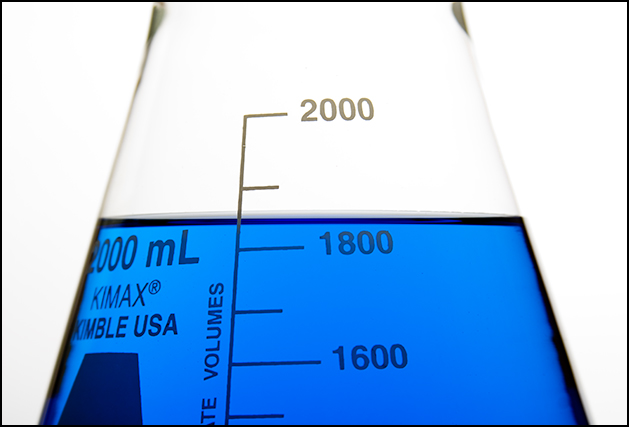
Lovely blue color and well done. Only nitpick (and indeed it is just that) is that flask was not on level table and it shows with tilted graduation marks. You corrected nicely by rotating with the liquid.
Post actions
Clear. Great choice of background. I vote 9.
Post actions
Perfect example of "less is more"! great lighting and idea.
Post actions
great...looks like a great stock photo...lovely colours and comp
Post actions
Very clear photo, great job.
Post actions
Interesting concept...the object looks almoust flat...must be cuz of lights but I guess its intentional. Simple shapes and colors.
Post actions
Nice tight shot. Good luck!
Post actions
The technicals are perfect on this photo. The symmetry on the composition is good, but the photo seems like it needs something more to put it over the top.
Post actions
Very simple and very nice. I'm sure this would do well in stock as well
Post actions
looks slightly off since one would measer from the bottom of the curve. Its a fun capture, nice colours and balance. But just doesn't pow me enough.
Post actions
Nice simple graphic image. Like the blue colour.
Post actions
very crisp, love the blue. Good Luck!
Post actions
Nice focus, and I like the simplicity.
Post actions
Nice, simple and clean. Technicly well done, except maybie for the the top edges of the glass.





 Add photograph to your favorites
 Add photographer to your favorites


