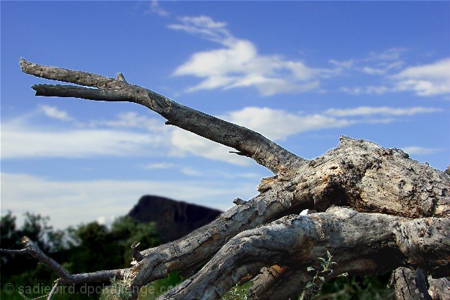
i wonder how many other people chose to submit a dead tree? i live in az...any tree was hard to find!
anyway, there's no crop on this. i used a touch of gaussian on the background and adjusted the color on the sky to give it a truer blue and darkened it. the tree in the foreground got a little lightening and a tiny bit of sharpening. then, i resized it for the challenge. i still can't get the hang of resizing but i'm working on it!
Statistics
Place: 201 out of 251 Avg (all users): 4.7537 Avg (commenters): 4.6667 Avg (participants): 4.6316 Avg (non-participants): 4.8611 Views since voting: 868 Views during voting: 291 Votes: 203 Comments: 6 Favorites: 0
the leading branch looks oversharpened. I see jagged edges on my LCD. This looks more like a jumbled pile of branches than a tree that's fallen. I like your score and OOF background.
the line between what's been softened and what's been sharpened is too obvious from the pixelisation and the thin cyan line along the top edge of the trunk, and unfortunately distracts attention quite quickly. the composition also feels a bit weak in that the portion of tree you've shown feels flat and uninspiring. My New Scoring System ™; composition + technical 1/3, challenge 1/1, post processing results 0.5/2, ooooh factor 1/3, originality 0.5/1 = 4
I like the repetition of triangular form in this image. But, unfortunately, the dominant branch sends my eye flying out of the picture to the left. The color and exposure seem alright...there is, though, some pixelation along the edges of the branch where it meets the sky....just a few things to think about for your next entry.






 Add photograph to your favorites
 Add photographer to your favorites


 Photographer found comment helpful.


