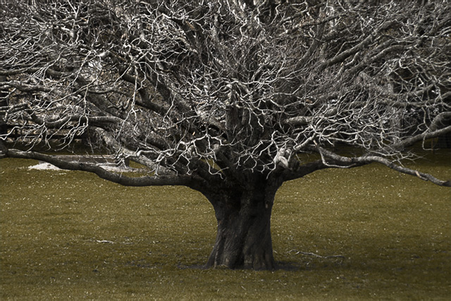
i love the tree itself, i think it's wonderful tolkien-esque with all the spindly branches and the super stumpy trunk. i also really like how the tree is solidly branching out beyond the frame, filling out the top corners so well.
however, i don't think that the selective desat does your photo any favours whatsoever; the b&w tree works, but the odd and unattractive mustardy green grass at the bottom just makes it look weird, and not in a particularly funky stylistic way. if you editted the greens to be less satuated and lighter so more white and pale, i think the shot would feel more balanced and dynamic. composition + technical 2/3, challenge 1/1, post processing results 1/2, ooooh factor 2/4 = 6
Nice composition. I might have cloned out the white pile on the left side and made this black and white. I find the green tone a bit lacking in boosting the image.
I like the way you've filled 2/3 of the frame with texture and 1/3 is smooth...it gives it a nice balance. I think this would be more impressive as "wicked" if the point of view made the tree more imposing...it's hard to feel threated looking down on something.





 Add photograph to your favorites
 Add photographer to your favorites


 Photographer found comment helpful.


