Dude that pic is incredible. Im learning Photoshop Elements 4.0 right now and those r the pics Im trying to create. I think its soooooooooo cool. peace, traci
I can only think of one word about the editing here: Why??
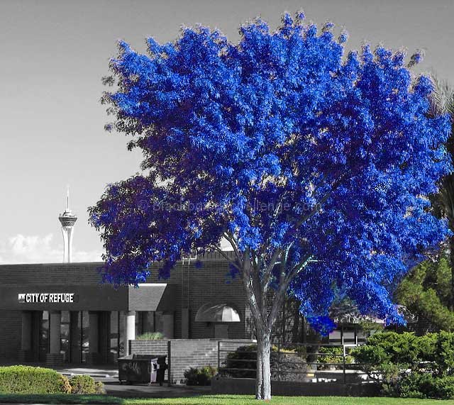
I don't see what the selective desaturation, and the unnatural coloration of the tree add to the shot. Sorry to be negative here... it's just that because we have tools to do these sorts of things, doesn't necessarily mean we should use them.
doesn't do it for me...........I'm not against selective coloring but this seems to be done just for the sake of mixing it up without much thought to why.........
I'm picking up more magenta, blue and green, rather than cyan ;P Nice work on the desat, but I would've been more inclined to go b&w with everything but the tree.
Uh-oh! Got a bit carried away here in post-processing. I'm sure it's intentional, but sorry, doesn't do anything for me except force a comment. ;^) Good luck!
Great title - one of my favorite words :) I like what you did here - refreshing in a challenge like this one! Also like the title of the building, good idea to show that off. Only nit I have is that the sky has some compression or sharpening ookies. Enjoyed!
Interesting idea but not so interesting to look at. I think it might have been more successful if you had colored all the leaves on the tree and dropped the color from the rest of the foliage. The truck merges with the background beacuse it's desaturated. A more limited depth of field to blur the background might have made this less busy....after noting the unusual color of the tree, I'm left pondering why the building says "City of Refuge" and why there's a refuse bin in the foreground. I also find the tower poking over the building a distraction. Perhaps a different angle of view would have improved the composition?





 Add photograph to your favorites
 Add photographer to your favorites

 Photographer found comment helpful.


