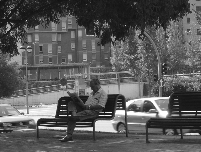
i tried this as have others and did not submit because the subject was in the process of doing something other than resting. The guy is reading. pity. Too much BG distracting.
A modern citiscape in B & W gives more emphasis to the main subject but when the challenge is over I would like to see the colour original to compare my thoughts.
I like the central character but the endroit is somewhat dull and makes for a fussy background. I appreciate that this may be meant as a contrast to his relaxation but I dont like it. Also find shadows too dark on main subject, though overal range of tones seems good.





 Add photograph to your favorites
 Add photographer to your favorites


 Photographer found comment helpful.


