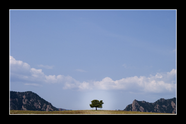
OK, rule of thirds be damned, this is a cool image. BUT you have a whole bunch-o-sky that is not doin' jack for it! I would crop it to a pano! Also, I am not sure about the "spotlight" thing on the tree. Looks like it was dodged a bit too much. For this challenge it is ok, but I don't really like it. For general use of the image, I would use USM on the whole range and present it as a pano. But that is just me...
Nice concept. One thing that hurts this photo is the 'peaks' being the same height as the tree and the fact that 80% of the shot is blue sky. Do not care for the glow around the tree. It appears unnatural because if that were backlighting from the sun, the faces of the hills would be more shadowed and the clouds would not have shadows on their bottoms. Anyway, would like to see this if it were shot from closer to the tree and from an angle that maximized the height of the surrounding hills. The sky does nothing here but minimize everything else so losing a very large part of it would be a good thing.
Hey! Not fair! You found the perfect tree I spent all day Sunday driving around looking for!! Hahah, never the less, Its one of my faves of the challege, I am a fan of the minimalism. Great shot :) 10 (even though you stole my tree :P)
this was the very first tree that came to mine when I read the challenge. I even tried shooting it a couple times, but didn't get anything worthwhile.
I like your composition here, although there's a bit too much blank sky for my tastes. your dodge work on the tree is fairly obvious, too. not necessarily a bad thing, but it is noticeable.
I really like the composition of this photo. While some might find the immense amount of sky to be somewhat overpowering, I think it gives a good perspective and sense of space. The colors are great and I appreciate the simplicity. I do feel that the dodging around the tree detracts from your photo, however; it's a very obvious spot dab from a brush and lends the photo to have a manipulated feel. That's dangerous, because then you lose a notch of authenticity, and in a wonderful photo like this I think you want it to feel as natural as possible. I like the choice to highlight the tree, but you don't want it to be obvious what you've done. Perhaps use a slightly larger brush that falls off more slowly, or lower the opacity to a degree. All that being said, I liked this shot a lot and it was in my group of higher rated photographs.
This is very nice, but I would have loved this waaay more without the overpowering border. Also, this seems like it would've been a good candidate for using the rule of thirds, if you could've put the horizon line about a third of the way up, instead of right at the very bottom. But still a good, unusual shot overall - 8.
Love this image. I like the border, although I'm sure you'll get comments saying the opposite, so I wanted to say that. The simple composition, open spaces, simple color scheme, all very nice.
I'm a huge fan of wide frames, but in this instance, it diminishes the overall quality of the view of this image, to my eye since there is actually no true black in the photo. I love that you centered the tree. I like how you used the sky as the largest part of the image as well.





 Add photograph to your favorites
 Add photographer to your favorites

 Photographer found comment helpful.


