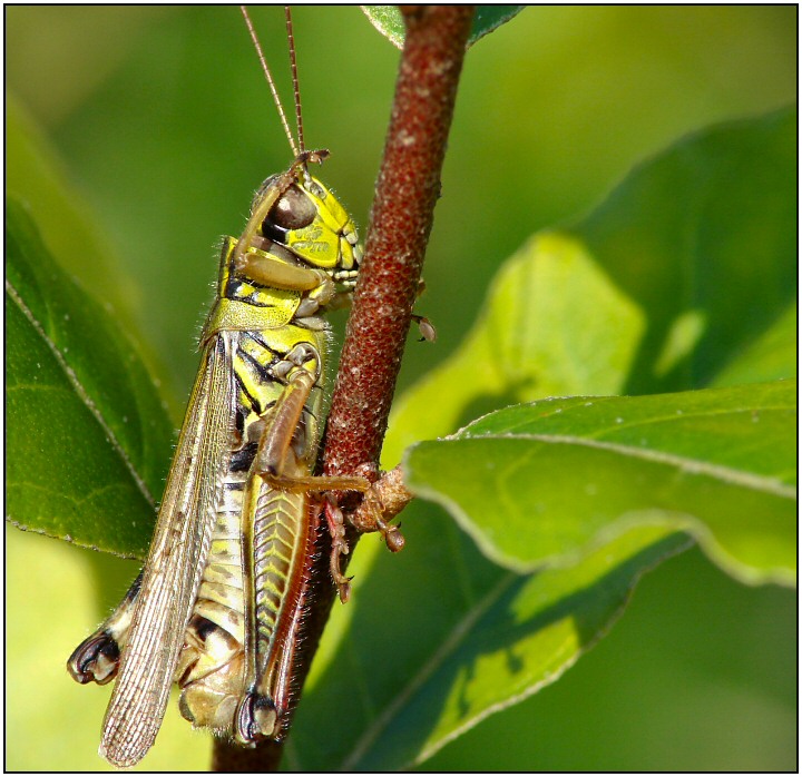
While hiking through a nature conservation area near where I live, I came across this grasshopper, and it just happened to "salute" as I took its picture. And who says insects aren't patriotic? :-D
It's not very often I get assigned an image to critique that is very similar to a ribbon winner. So what is different between your image and the 2nd place image? First, I would have to say the lighting. Your image was obviously taken mid-day compared to the early morning light of the ribbon winner. You definitely had harsher lighting conditions to shoot under, which in turn made it tougher to capture the details of the grasshopper. Compositionally, I think your image is almost as good, as the angle of the other grasshopper provides a bit more depth to the photo. Background, I score this a tie, as neither background has and distractions of note.
What left is in the overall look of the grasshopper itself. Your image looks flatter than the second place image. Part of this can be attributed to the lighting but part is a result of the post processing. I see by your post processing comments that you used clarify, which is part of Paint Shop Pro. I would encourage you to revisit your post processing steps and play around with levels or curves. I think you will find that if you decrease the gamma in levels (the middle slider for input) and boost the contrast, the grasshopper will gain a lot more depth. The same can be done with just curves but is harder to explain in writing the curve shape that is required. If you have problems getting levels to do what you want, I would be more than happy to tweak it and send a screen shot of the levels settings. I really like this image and with a little more post processing it can become something special.
Feel free to PM me if you have any questions regarding this critique.





 Add photograph to your favorites
 Add photographer to your favorites


 Photographer found comment helpful.


