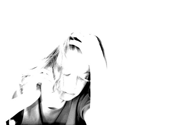
thanks to everyone for you kind words (and to those who didn't have anything nice to say). this photo definitely got misunderstood, and that's totally my fault. one of the things i don't think many realized is that she has a phone in her hand. this photo stemmed from my recent frustrations with dealing with a big telecom company and getting absolutely nowhere every time i talked to someone new. the title ties that in. i think if i were to re-do this shot, i'd use a black phone so it didn't get blown out with the rest of the photo. if i were going to reshoot this for myself and not for a challenge, i'd take out the phone completely.
oh, and just for the record - IT WAS OVEREXPOSED ON PURPOSE AND I GOT EXACTLY WHAT I INTENDED.
I like this photo. I reall transports a mood. But I think the title does not fit. When I'm not satisfied with a product I would not look _that_ desperate ;-) Something like "jobless" or "paying the bills" would be better IMHO. Technically... I guess many will say it's overexposured but it's ok for me. It really creates a strong mood. Negative space also helps to stress the desperation.
I like the how this picture seems to project despair. I like the high contrast and negative space on the right. For my personal taste, I wish the subject was just a touch sharper. karmat
Great composition -- this is one of my favorite photographs of the week. Did you try from a slightly lower angle, with the subject filling just a bit more of the frame? I'm not sure I'd like that better -- just wonder how many variations you have of the photo. Excellent! LanSnake
best of the bunch! great composition, lighting and contrast--and great mood. Looks like she is depressed --why not about money?!! I'd hang this on my wall. 10--amitchell
I can't make up my mind with this one. There is just enough detail there to catch her expression and I think I like the high key look. I'm not sure of the composition, did you try it with the woman filling the frame, ie cropped along her left arm and tight over her head. I can't decide which works best, yours is certainly the more unexpected look. Will have to come back to this.
Great use of negative space! I like the way the 'consumer' blends with the background, kind of like we all do to businesses. (Dang, I hope that's how you meant it)... Currently a 9... will be on my list to consider for a 10
Composition - good Technical Aspects - way blown out for me - even if trying to show a mood Meets Challenge - I can't be sure Visual Impact / Originality - not much/ high
I like the idea but its too blown out. I'd like to see some more detail. Also the white doesn't really symbolize dissatisfaction to me. I might have tinted this whole thing red or maybe left it in color and used high saturation. Hmm... I wonder what that would have looked like.
Normally I am a fan of negative space, but I do not fel that it works here. Maybe the figure is too bright and seems to bleed into the brightness (although I am sure that is what you intended, it just does not work for me).
too bright, or cropping it down to just the subject might've taken away from the brightness. The phone in her hand isn't even noticable unless you really look at it.
I think most would be tunred off by the excessive use of white, but it works for me. The composition is good, the large white areas convey the emotion in the face very well. Very artistic.
This one's really caught my eye. I know it's a pretty bold artistic statement to make on this site, but I think you've done it amazingly well. Great job. 9
Wow - love it. Excellent pose from your subject. Great use of whitespace and bold, confident use of your photoediting software. This week's winner I hope.
Been there! I love the b&w, the composition, and whatever you did to give it the "overexposed" feel (please forgive my lack of technical expertise). Also projects to me an "isolationist" feel which I think most people feel in regards to the "consumer" versus "national economics" dynamic. Love your concept. lhall







 Add photograph to your favorites
 Add photographer to your favorites


