Author Thread Comments Made During the Challenge
Post actions
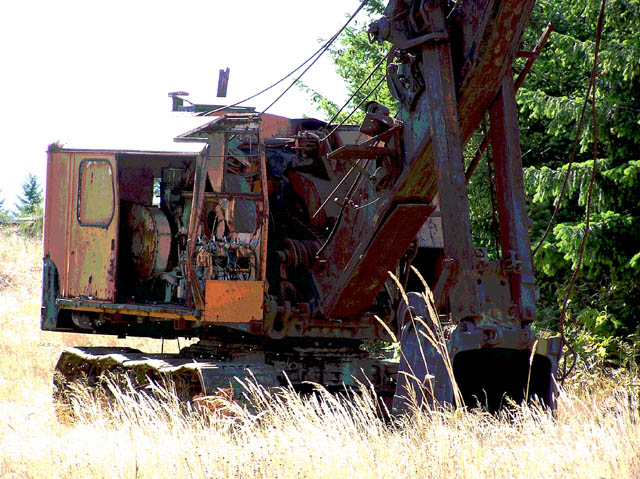
Nice idea for the challenge. The foreground and left side of the frame seem a bit "hot" though.
Post actions
the darks are too dark and the lights are too light... in short too much contrast.
Post actions
Post actions
the grasses in front are blown out. a better angle or closer POV might have helped alleviate that. try to avoid shooting into the direction of the sun.
Post actions
Post actions
What a catch! Character that is second to none here!
Post actions
Post actions
Good play on words in the title. Looks overexposed in areas.
Post actions
He, he, funny! Looks a bit overexposed. I like the composition though. ~7
Post actions
nice idea for the challenge, a bit too overexposed on the left side
Post actions
The lighting doesn't work here. Way too harsh and too much on the foreground and not enough on the subject.
Post actions
Seems overexposed to me....
Post actions
Post actions
Good title. Interesting solarization or effects on this. Good capture.
Post actions
Too much contrast. The upper left part of the image is too bright.






 Add photograph to your favorites
 Add photographer to your favorites


