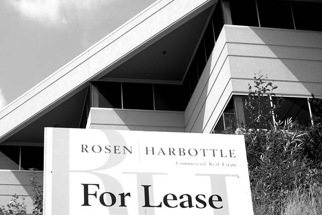
I really like how you've used the lines in this composition. Everything is so angular, and the shadows jsut emphasize and strengthen that. The black and white also makes it powerful. karmat
Nice architecture - improved by the B&W. But I think the lease sign is a little too central. I think I'd also have played with the curves in photoshop a little to make the light greys a little darker - give it more contrast.
Nice, nice image. Great composition, great clarity. Love the diagonal line with that little bit of sky showing and the juxtaposition with the shape of the For Lease sign. Great job.







 Add photograph to your favorites
 Add photographer to your favorites


