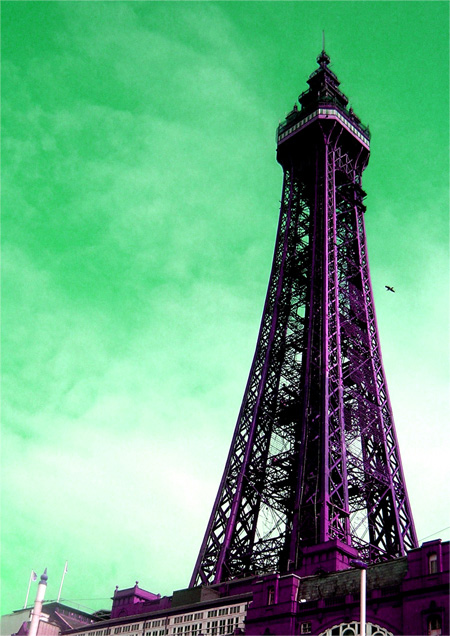
its a tower. :) i spent aaages on anothyer photo and i just didnt like it. and i wanteed to enter the simple pleasures challenge but i can only enter one :( made me sad. so i thought id eb=nter one that i didnt really care much aboot.. but i do quite like it cos its geen and purple and not like normal pics :).
crop
hue
contrast
Statistics
Place: 265 out of 320 Avg (all users): 4.8647 Avg (commenters): 5.7857 Avg (participants): 4.7527 Avg (non-participants): 4.9561 Views since voting: 1066 Views during voting: 275 Votes: 207 Comments: 17 Favorites: 0
I really like your style Sarah. You are bold and have your own flare and a very cool way of putting it out there. Please don't let dpc scores ever change that in you!
Not my favorite gradient. I think black and white would be nice instead. But, ignoring my personal tastes...you've hit the nail on the head with the rule of thirds...most important to me...what the heck...10





 Add photograph to your favorites
 Add photographer to your favorites

 Photographer found comment helpful.


