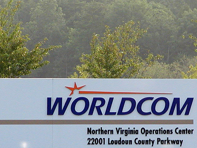
propitious timing to be able to take the shot of the sign, but couldn't you have done more with it to make the image more interesting? I'm not sure what, but maybe some people? 4 sjgleah
I'm sure the bottom of the sign wasn't interesting, but how do the trees add to this photo? I don't like the sun flare near the bottom of the sign, I'm thinking this would have been a good candidate for cropping (you know that cropping is legal, right?). Cropping the sun flare would have also dumped most of the trees in the background, also a good thing (in my opinion). This is a very clear shot of this sign. (Ever consider working in their advertising section?) 6 Swash
So you modified this sign to be your art? (bad joke/minor slam)
The contrast between the sign and the greenery is interesting. It is kinda static, though; it looks flat to me. Maybe a different angle, or different time of day to catch some shadows. karmat
Yes it's a Worldcom sign. And...? Where's the message. This picture wouldn't work at all without the recent news stories. I think you need more in it to keep it alive after these couple of weeks. And why can we see trees? Focus is a little off too.
And? This just seems absolutely pointless. Really, why waste our time? I'm not trying to be rude, but there's so much you could have done with this photograph. Even the title isn't creative. Sad. Even if you had just slapped a sticker on the sign that said, "We're screwed!," well, at least that would have been something.
Just a close up of the sign only with someone holding "will work for..." sign would have been great on this. The trees take away from the sign though, I would have cropped it more.





 Add photograph to your favorites
 Add photographer to your favorites


