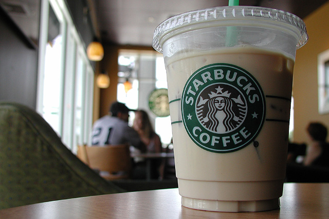
I like the idea but not think the background/ non could be better. The chair at the left is a large block of darkness. I like the people in the background but find the 21 distracting.
Big corporation, good enough pic, estimated effort (rather not say....). The shot itself is pretty good, but the background is difficult. (joke: were you hanging out with Tom Walthrop? see him comments after the challenge, I am being nice to you!) Suggestions: take your cup up to the counter, use a menu as a back drop (or anything else interesting up there) ; or take the pic of the iced latte being made; or you enjoying it. (tried the 1/3rd rule? it helped) 7 Swash
Nice composition, but would have NAILED the challenge if the folks in the background were in suits/ties (yes, I know, you can't walk up to folks in a Starbucks and tell them "HEY! We have a dress code here!! Put on this jacket!)...Shallow dof works real well here...
This is the best picture of a Starbucks coffee cup I have seen today. That can't be coffee in there can it? it looks foul. I know there's not much to play with here but it looks a little dull and lifeless, no striking colours or anything to make it other than a snap of a plastic cup. The image is a little dark on the right side.
This is an interesting picture. I really like it from a technical standpoint, and I don't think I can take anything away there. I really like the use of DOF; great idea. The Corporate image is a little tenuous, but it would have been spot on (in my opinion) had the people in the background been wearing suits. Costs points – but not many… (8)
A vertical format would emphasise the giantness of the cup (and thus starbucks) as well as cut out the green chair in the bottom left. You need to decide if you want the straw in or out of the cup as it leads the eye out of the picture.
The second Starbucks photo Ive seen this week and by far the better of the two. Good strong contrast and colours. Not really a strong enough link to this weeks challenge, though.
Since I'm voting on your photo at a Starbucks using their wireless network while sipping on an iced moca, I gotta give you at least a little extra for the precognition:) It's a nice entry anyway.
As for the challenge, Yup - on target. I like the composition, but would have preferred to see it cropped down just below the lid, crop out the person on the right, and crop in just a little tighter to the couple on the left, cropping out a lot of the chair or whatever it is. lhall
It's a drink, with a company logo. I like the DOF and the level of detail, but this looks more like an ad to me than a commentary on the business world of today.
Mmmmmmm... is that an iced white chocolate mocha?!? Good subject, good DOF. I think I'd like it better without that green chair on the left. Also, cutting off of the straw is a bit distracting.







 Add photograph to your favorites
 Add photographer to your favorites


