All I can say is, "Even a blind squirrel finds an acorn once in a while." Thank you for all of your kind words and and thanks to all of you who I have learned from and who selflessly continue to help those like me, through comments, forums, tutorials e-mails et al to build skills.
--jrjr
Statistics
Place: 2 out of 251 Avg (all users): 7.0148 Avg (commenters): 7.5161 Avg (participants): 6.7527 Avg (non-participants): 7.2364 Views since voting: 19260 Views during voting: 416 Votes: 203 Comments: 72 Favorites: 18 (view)
Whoa!!! How in the world did I miss THIS photo! I think I was on vacation when this challenge came around! This is so incredibly striking and cool! Looks like you are one of the ones people can lear from too! :)
why did everyone vote so highly for a photo that is more a product of photoshop and gaussian blur than the others that are much more deserving? perplexing. oh well.
Dear Jr as much as I am not all about the over doing on DP I really do like this photo. I really think you did a great job and your second place really shows it. CONGRATS.
It's such a memorable, different and dramatic pic that it deserved to ribbon. I actually like the whole smooth finish. The neatness gives it surreality ..Congrats on the Ribbon.
Great subject which begs the question why you felt the need to coat in pixel syrup. I'm genuinley interested to see your original here, because I find myself yearning the detail that has been excluded. That dead bark must be rich with interest.
I would have liked this photo so much better had some original texture been left in it :/
This is definitely a "Right place at the right time" ribbon win. We all need a few of those. Hold on to it dearly.. but my advice? Give us some texture next time :)
Well done. You make the most of your locality and State. I wonder, though, if you could make those refineries look lovely in a photo too? ;-)
Ha! No refineries down our way (Cape May)- Southern New Jersey is why we are known as, " The Garden State".
Thanks Brooklyn- (Wanna buy a bridge?)
--jrjr
Pretty nice but HAVE to echo the negative post proc sentiments.
The branch looks like a CGI Anime tentacle.
There is also haloing evident due to the agressive 'denoising'.
hum I like the moody feel and the composition, but I agree that for my personnal taste the post-processing is too strong. I would be intrested to see the same photo without the post-processing.
The processing here is incredibly heavy-handed, it's a well composed image, but the excessive neat-image and haphazard dodge & burn (or whatever you've done to it) really detract from the end product.
Clearly the majority disagree with me, but I think the sentiments of Petrakka and Haakon certainly warrant an echo.
I must say, I have to agree with petrakka - but it just goes to show that you never know what the rest of the world is going to think of your art. Congratulations on your ribbon.
well this is a nice image but to me it lacks much photographic quality and has been treated to the point of being more representative of painting or digital art.
I do like this as an image, I do not see it as a photograph. There is a complete lack of detail and what looks to be sloppy editing.
I really can't believe this placed. Nice seeing on your part, just think the editing is, well...it makes it not a photograph.
I like the smooth velvet feel of this image. The arch of the tree adds a nice bit of curve to mostly otherwise straight lines of the water's edge and the horizon. I like the rich brown and gray blue tones with that touch of white. Quite lovely. After a review of all the images, bumping up.
the doging at the water where it meets the wood is pretty sloppy. It really hurts an otherwise very nice composition. Given that this is advanced editing carefull reworking with layers could get rid of that issue as well as bringing up more detail in the wood grain.
Very nice capture but I am going to have to be honest with you. I had to look at this picture long and hard because of the aggressive post processing. One minute I felt you had gone over the top with the noise reduction software and removed to much detail and the next minute I feel it was a good thing. After debating on a 9 or 10 I will have to award you with a 10. Even though I feel the processing is over the top, it fits the theme and photo.
I like the composure here and the way the tones and lighting frame the subject tree. I am also captivated by the likelihood that this tree grew at that location... It looks to me as though some extraordinary forces planted a very large piece of driftwood for us to marvel over. The post processing of the photo isn't quite as subtle as I prefer yet I suspect that it takes harshness out of the scene which would likely be more distracting.
Tuborg? Another nice piece of eye candy. The abuse of dodge and burn makes this look completely computer generated though, and for this shot I don't think it was the way to go. Of course it will score well, I have no doubt. I still wonder what exactly nature had offered to my eyes here before photoshop smashed it out of existence.
too much, or rather, too obvious post-processing. halo around the trunk and discolourations on the sea on both sides of the trunk. nice sky though and creamy sea. the textures of the trunk are also nice. but on the whole it's too much for me. a more subtle approach might please me more, but in the end this is your photo so do as you please.
Love the eerie sky.....and the effect it gives one in this striking image. One of my top picks for this challenge, as it is so dramatic, and hope this one ribbons.....My first "10".....
IMHO a perfect picture - the colors are STUNNING.... the pp is great... - 10
....second look added to my favs.... :o) personally I think the pp suits perfectly here, maby because it is rather oobvious and I think it goes with the mood of the picture... love it.
I like the composition and your intention with processing. However, for me it's little overdone. I think it really stands out for the worse is in the water near the letters on the tree. the water gets brighter in that one area. I do like the rest of the tree and sky. 6, cause it's way better than 5 but it's not a 7.
This has a great dramatic feel. Something about the contrasty look. The bright highlights of the breaking wave and the cloud highlights contrasting with the overall darker tones.
I really love the colors in this one, but it looks a little too post-processed. The dodging is very noticable on the tree - especially near the tip where it actually starts to bleed into the clouds! Just remember, everything in moderation (the fade control is your friend!). Otherwise, the composition and tone is really nice. Great eye for the shot.






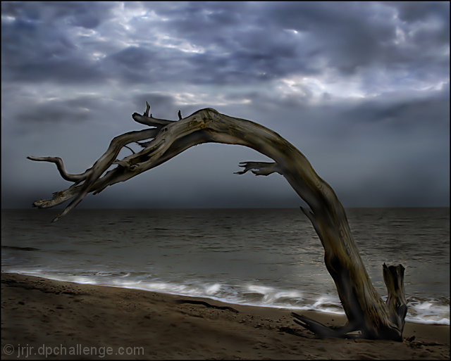
 Bent But Not Broken
 Add photograph to your favorites
 Add photographer to your favorites

 Photographer found comment helpful.


