Critique Club Review:
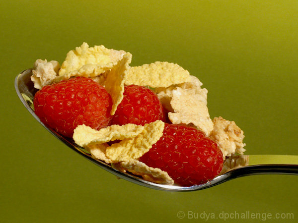
Nice sharp detail with a good depth of field. Lighting is good. Color, saturation and hue are very good.
I'm going to have to go with the others and say that the green background is unappealing. Just doesn't seem to fit with the food.
I would like to have seen some milk in the spoon. I don't eat cereal dry, but my niece does, so it isn't huge on that point. (I hear they use white glue for the milk.) I also hear they spray the fruit with oil to make them look fresher. The berries do not look bad here, but is a thought.
For a backround a bowl of cereal, ceral box, several ideas come to mind. Whether they were rendered sharp or soft with a shallow depth of field, I think it might have worked better and the angle of the spoon less critical. |







 Add photograph to your favorites
 Add photographer to your favorites

 Photographer found comment helpful.


