Critique Club Review:
Color, saturation and hue are good. Brightness and contrast are OK.
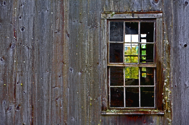
Lighting makes the picture look a little flat. I can tell by what I see that there must be a lot of texture there, I just don't see it with this lighting.
You've followed the rule of thirds, but what happens here (at least for me) is the eye follows the windows to the the bright sky above the bit too soft trees. Once there, the sky is pale and featureless.
The windows are a nice effect, they just keep leading us to nowhere. I believe that is why you received the "forced" comment below. The windows command so much attention, that they really need a powerful subject when you get there.
I have no idea which way this builing faces, but a sunset in that window with some fill flash on this side, would be killer for me. |






 Add photograph to your favorites
 Add photographer to your favorites

 Photographer found comment helpful.


