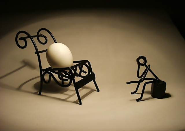
The use of light is very good. I can't agree at all with the commentator below who complained about the top shadow; the shadow curve is one of the strongest elements here.
There are some problems with the sizing: artifacts and impure lines in the shadows under the chair and sitting thing. The spots on the egg don't help, neither does the lack of texture on front of the egg. When you resize it and put it on your portfolio, I'm sure the results will be great.
This was the first shot that came up when I started voting. Things went rapidly downhill! Very inventive shot, original is an understatement. SUPERB use of light and shadow, the composition is excellent. 10
clever and different. I like the composition but not the lighting. The shadows are very harsh and a significant portion of the frame at the top is in shadow. I think this could work when setting a different mood, but it doesn't do it for me here.
A perfect photo, requiring a perfect title. "Absurd" alone, IMO, would be sufficient and stronger.
The use of of what appear to be 'commercially produced' props of the gift-shop variety may have a disconcerting effect on the creative purist while reserving a point of delight to the ironically inclined... ;-)
How unique! I love the concept....the color contrasts are fabulous..the shadow created by the chair adds some interest to this photo...everything looks really crisp and sharp...
The more I look at this photo, the more it draws me in. I definitely like the contrast in the colors and the shapes, as well as the inherent fragileness of the egg compared to the strength depicted in the chair and figure. The color is very nice. It does seem a bit fuzzy though I do not know if this was intentional or a result of downsizing - regardless it does give it a dreamlike quality. Excellent job!






 Add photograph to your favorites
 Add photographer to your favorites


 Photographer found comment helpful.


