Author Thread
Post actions
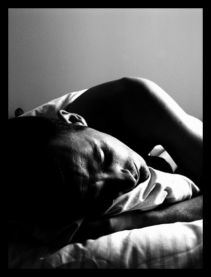
A wonderful image that accentuates the title but the lighting takes it beyond the mundane.
Post actions
brilliant, how on earth did I miss this while I was voting For what its worth now 10++
Comments Made During the Challenge
Post actions
Nice "artsy" appeal. Good shadowing
Post actions
Post actions
nice! love the harsh lighting. like the contrast: he's sleeping, yet because of the high contrast it doesn't feel restful. only thing that bothers me is the thick border.
Post actions
Very nice. Should be a ribbon winne. Small dark object on left edge, just above subjects head, is the only 'complaint' I have. -9-
Post actions
I like the angle you chose. Very creative. The lighting is right on. Good luck! Vote 9
Post actions
Kind of gritty, like the composition - it reminds me more of a landscape than a portrait and that's an unusual approach. Like the high contrast.
Post actions
Lots of detail, nice shadows!
Post actions
a bit dark but captured the challenge well, nicely composed
Post actions
Post actions
Realy cool, a god blac and white is almost unbeatable at showing feelings!
Post actions
Great use of lights and shadows here I like it alot :) Good job
Post actions
Great moody lighting. The lighting you chose really give the shot incredible contrast. The shadows are awesome. "10"
Post actions
I like this slightly too dark on the left though, did you use a gradient map? If the light was as is shown coming from the right, then spot metering would have been useful or exposure bracketing. None the less I like the composition a lot =9
Post actions
Like the framing and high contrast.
Post actions
I like the B/W, good detail.
Post actions
The black borders are too thick and distracting.






 Add photograph to your favorites
 Add photographer to your favorites


