cropped, levels auto fix, adj. hue/sat, contrast and tint. lightened. adj. hue and sat again.
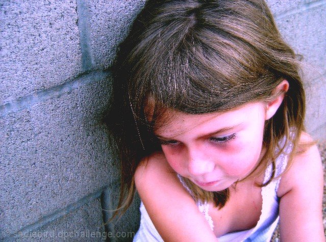
this is my VERY happy and well-adjusted daughter. she wanted to be in one of my DPC photos so we put some makeup under her eyes to darken them and headed outside. she made a great model! my husband HATES this picture!
here goes nothing. hope it's pastel enough!
Statistics
Place: 188 out of 203 Avg (all users): 4.5307 Avg (commenters): 4.1000 Avg (participants): 4.3881 Avg (non-participants): 4.6161 Views since voting: 954 Views during voting: 289 Votes: 179 Comments: 16 Favorites: 0
at the time, we were really trying for a more creepy, undead thing but, obviously it didn't work. the sun was in her eyes and she couldn't look into the lens. if i could fix it, i'd crop tighter and make it smoother. i'd also probably go with more pastel purple than pink. i learned a lot from this one, though.
I did something like this once with my son...made him pasty looking , and then he closed his eyes and looked dead...my wife wouldn't let me post it...and really I get that, so your husband dislike makes sense...
poor kid! I like the angle you used on this one..makes the whole shot a little edgier...
I think it's wonderful to use pastel colors to create an effect not usually associated with pastels, but that is way beyond the proto-neanderthal understanding of the average dpc voter. I personally gave you an 8.
I like the model's expression playing against the stark wall. The color looks unnatural and her hair looks oversharpened. Hopefully you'll post the original after the challenge - I bet it's something special.
Awww, this pic has a lot of potential. Your model's expression is great and the composition is nice. The post processing does it in though. Her hair is too pixelated (oversharpened?) and the saturation is too much. Her skin appears almost blue or purple.





 Add photograph to your favorites
 Add photographer to your favorites


 Photographer found comment helpful.


