Author Thread Comments Made During the Challenge
Post actions
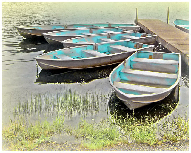
Looks like a painting, Nice job.
Post actions
The pastel painted into the boats is too teal.
Post actions
That is fantastic. Wonderful colors and composition.
Post actions
Yep this is a lovely SUNDAY picture. Nice pastels and the yellowish vignet looks great
Post actions
Really pretty, it almost looks like a pastel painting. Fabulous.
Post actions
Nice image but the halos around the end of the dock and the last boat are a little distracting to me
Post actions
Way cool - how much editing in the color did you do? I like how the blue really pops out.
Post actions
I wonder if you used desat on the boats the blue stands out a lot, but I really like it...interesting composition aswell.
Post actions
I really like the composition!
Post actions
Nice composition and colors. The grass is a little distracting, but not enough to count down.
Post actions
The grass looks a bit washed out, but otherwise it's a great shot!
Post actions
Great composition but seems a bit over saturated to me
Post actions
soooo very pretty! i love that color on the boats! wow! perfect for the challenge! 10!!! I hope it makes the top 10!
Post actions
Love this composition. The colours are very nice. The boats seem a bit soft, maybe too much neat image or noise reduction?
Post actions
Beautiful composition, bit overprocessed for my taste
Post actions
This is one of my personal Top 10.
Post actions
Post actions
Post actions
I love the composition and the idea. I might tone down the aqua just a smidge. To me, pastel is VERY pale, but that's my interpretation. Lovely image overall.
Post actions
very nice image...love the editing and the final result, well done





 Add photograph to your favorites
 Add photographer to your favorites


 Photographer found comment helpful.


