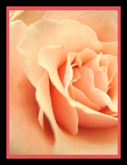
I like the color of the flower and the slightly different crop.
Two things really stand out for me that could be improved - the border and the noise in the dark areas. I agree with the comments below about the border and have nothing to add, except that a different color on the inner border may work better if you still wanted it. The noise in the dark areas is quite a bit and probably could have been removed during editing. The rose is nice and soft, but makes me wonder if it's soft on purpose or a bit out of focus. I would have cloned out the little dot in upper right corner.
The softness of this image and the stunning pastel hues are overpowered by the harshness of the frame. I do find this image very appealing and the high vote it garners will not be offset by the frame. I can only hope that others will vote in the same vein.






 Add photograph to your favorites
 Add photographer to your favorites

 Photographer found comment helpful.


