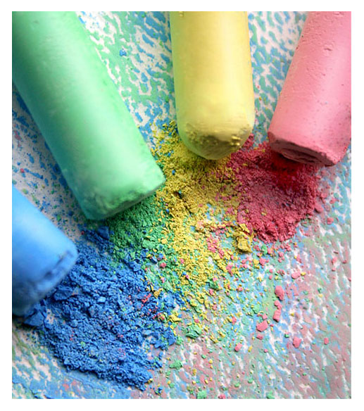
This is a lovely image with crisp, clean colours. A lovely highly saturated pastel image. The lighting is excellent. The texture of the pastel flakes works very well, as does the tooth of the paper below. I like that the colours have blended on the paper to create that lovely soft grey you get with pastels.
The composition works well, with the lines of the pastels leading the eye into the powdered sticks in the centre. The contrast of the occupied space of the top and the empty space of the bottom right is very effective as well.
The only problem I see with the image is with the depth of field. I find it rather distracting that the blue pastel is so out of focus, and the red pastel is in quite sharp focus. I realise that when you’re dealing with macro like this, a shallow depth of field is unavoidable. I just wish it was even.
So, a very good image indeed, with just one little niggly crit. You definitely deserved your top 20 placement. Well done!
If you have any questions about this crit, please pm me. I hope it’s helpful for you1
very nice. my only suggestion would be to slightly increase your depth of feild to have the chalk tops in focus as well. I see this as a nice poster ina childs room. 7





 Add photograph to your favorites
 Add photographer to your favorites

 Photographer found comment helpful.


