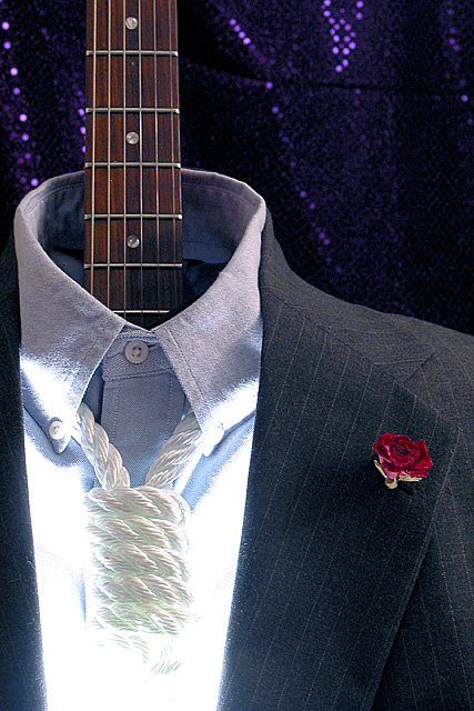
Bye-Bye Miss American Pie The R.I.A.A. is ready to tie A noose so tight around the music you buy Even Wall Street accountants will cry This was the The Day The Music Died!
Statistics
Place: 17 out of 116 Avg (all users): 5.6988 Avg (commenters): 7.5385 Avg (participants): 5.5165 Avg (non-participants): 5.7976 Views since voting: 1071 Votes: 259 Comments: 33 Favorites: 5 (view)
I was just reviewing some of the comments on this photo, and I was shocked by the amount of people who didnt get the connection to Corporate life. I would have thought it was painfully obvious. Oh well you still have to agree its a wonderful image.
Hokie, I am VERY disappointed this picture didn't do better. I honestly thought it would win. Anyway, it was very artistic and very well done.Outstanding. Please let us know how you did the light around the rope. Bravo for a superb picture.
Cool. No criticisms about this one from me, but there are a lot of things i like about it. The overexposure on the noose gives it a surreal effect and I like the color splash the rose gives. This is just a very good picture, I think. karmat
i love the light on the rope .. where i think this image falls down is the guitar neck isn' t with nearly as much interest. would like to see a good rim light picking up the edge of that guitar neck. one of the more creative images :) .. mag99
I'm glad someone had a way of dissing corporate made music. I'm thinking that people most likely have a problem understanding this or that they think that bright light around the noose makes it flawed, I say well done.
Somehow, I thought of having commented on this image earlier this week (and was somewhat negative about how the bottom of the rope was washed out by the light. Now, I see that as a strength to make it more symbolic). Anyway, I wanted to revisit this image. It is a very strong image and I like it more than when I first saw it. Have been wondering how you did that white light surrounding the rope? It's very cool. Also like the background, the composition and the way you cropped the left. The props you use are very to the point and all represent nice touches. It's a very artistic image and also very eloquent. It does sum things up pretty well, doesn't it. I upped the score a few notches and can't go any higher :) It's all right on. Journey
As a music-lover, I couldn't agree more. As a photographer, I like the contrats of the glitter, the blue-collar shirt, and the guitar versus the suit, rose and 'necktie' -- WOW! Eloquent.
Weird image. The guitar dressed up in a suit is really creative. I get the noose thing, but I'm a little confused about the bright light there...I'll assume it's intentional, but I don't know what it's trying to say. And in this sort of story photo it seems like it ought to be saying something. I don't like the purple sequined background...I think it should either be more out of focus or be a plainer black or dark grey or something. If this were my photo I probably would have titled it "Napster" :-)
I really like the lighting, the noose, the rose etc. But I can't see why you have the guitar neck - what has a guitar got to do with a picture that, I think, would be ten times better without it.. I would have given ten for this without the guitar - hope I'm not being to pedantic here. Having said that I still give it 7...
Well staged and very interestingly lit. But badly over exposed below the noose. And I'm not sure I understand your concept. But that's my problem - not yours.
Interesting shot, but I am trying to fit it to the challenge. It is there, but a stretch for me. I do like the shot though! Great for a "music to die for" challenge... Creative lighting...
Wow, very, very cool. I know you have some sort of message with the bright light below the "necktie", but to me, it's too bright. Fabulous idea! This reminds me of a musician friend of mine. He works for $$$, but only when he HAS to. I want to give this a 10, but the light drags me down to 9. Swash
i think this is a really neat photo. the harsh lighting around the neuse adds a neat effect. i'm struggling a bit to see 'corporate world' in this photo, but I like it anyway... great effort :) - jmsetzler
I like it! I don't know if the washed out whites near the "tie" was intended, but it destracts a bit from the picture, in my opinion. I still had to give you an 8 for the overall image.





 Add photograph to your favorites
 Add photographer to your favorites


