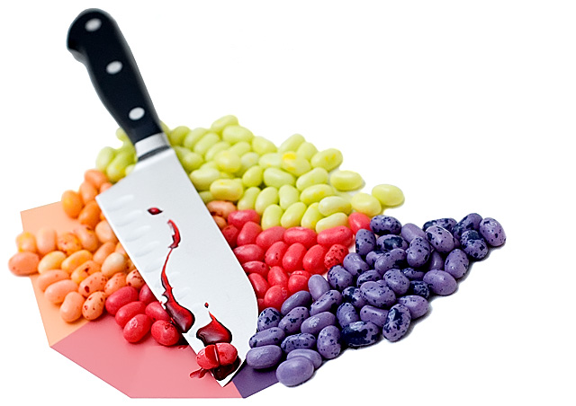
This is my first DPChallenge submission. The pastel colored Jelly Beans at Borders caught my eye after I saw the topic for this challenge. I then went to a paint store and got some matching colored paint samples to put underneath them. Fake blood from the party shop and a knife. This was shot in my bedroom ontop of a white muslin cloth with one sb800 bouncing off the ceiling. Dodged out most of the background, ran it through noise ninja, usm, levels.
Statistics
Place: 84 out of 203 Avg (all users): 5.6793 Avg (commenters): 7.2353 Avg (participants): 5.1642 Avg (non-participants): 5.9744 Views since voting: 1372 Views during voting: 312 Votes: 184 Comments: 21 Favorites: 1 (view)
Firstly congratulations on submitting your first photo at dpc Ross :) This picture doesnt quite work for me for several reasons, I think you overworked the image to get the bg a pure white and (as was mentioned in an earlier comment) it makes the image look as if it was cut out and placed on a white background. For me the card adds nothing to this shot and I wonder if you were just adding 'pastel' colours to the image. I'm sure you could have found a better composition for this shot as although you took the time to seperate the beans they look badly angled. I took the liberty of downloading the image and played with rotations and crops (tight on just the beans and blade) and, imho you'd get a much better effect.
I like a good title and think it finishes of an image and sometimes helps the viewer understand more about the image. I will never vote down an image because of its title or lack one but will sometimes add a point if its spot on with the image and isn't used to shoehorn an image into a competition theme - I loved yours Ross :)
I think its a clever idea but with imperfections in composition and post processing and, after looking through your site I think you'd agree its not amongst your best work? You have some great pictures there and if you submit work like that your first ribbon is around the corner!
Maybe to make it more realistic, the knife could have been straightened up, to a more vertical position by putting it into some white foam or a small hidden C-clamp. That would hold it in a natural cutting angle. The paper detracts. Great title.
I'd like to see a retake with a dramatic, suspensfull, black background and beans made more pastel. Then you would have to add a small spotlight on the knife, if you wanted the handle to show. Pastel would bring out the blood and knife more.
Nice lighting and a clever idea executed (hehe no pun there right?) well. Like the DOF you chose to shoot at as well. This is really a spot on shot that needs no improvement IMHO. Well done, 10 from this voter.





 Add photograph to your favorites
 Add photographer to your favorites


