Editing Procedures used:
Converted from Raw with Titanium white balance (because it looked better than the others).
Adjusted highlights.
Contrast Filter.
More highlights adjusted.
Saturation layer do decrease saturation and make the colors look correct.
Crop, Neat Image, USM
Re-size, Post Re-sizing USM
Statistics
Place: 141 out of 203 Avg (all users): 5.2198 Avg (commenters): 6.7143 Avg (participants): 5.2121 Avg (non-participants): 5.2241 Views since voting: 970 Views during voting: 268 Votes: 182 Comments: 9 Favorites: 1 (view)
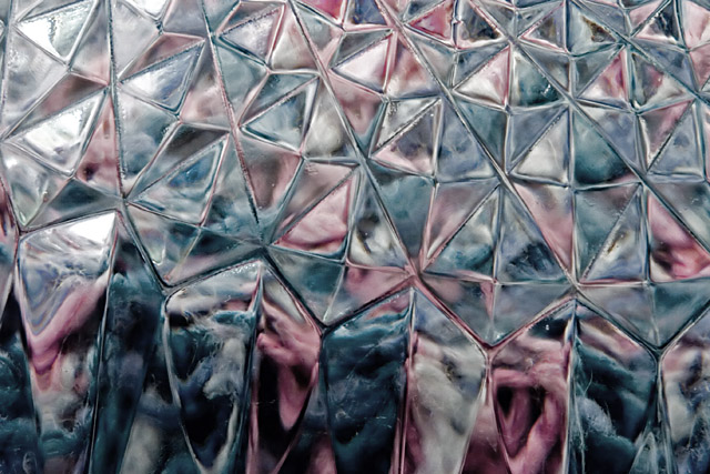
I just like sitting here and looking at this one... The shapes seem to change as you look at them, along the bottom of the frame.
Focus and depth of field are done very well. Color, saturation and hue are fine. The whites could be a little bit brighter for me. Contrast and lighting are well done. Detail is not lost in the brights or the darks.
I'm not sure how you could have done it, but the only thing I see is that the pattern seems to run off the edge. Maybe catch it along the lines of the patter for the edge of the frame. But that would be really tough.






 Add photograph to your favorites
 Add photographer to your favorites

 Photographer found comment helpful.


