It is a lovely image..I think the voters are getting tougher these days..But IMHO there is not a pastel colour here at all, I think that is what lowered your score. And for me, meeting the challenge is top priority.
FWIW I didnt think tuborgs shot should have placed so high. Again, it is a great shot, but that does not transcend meeting the challenge, for me.
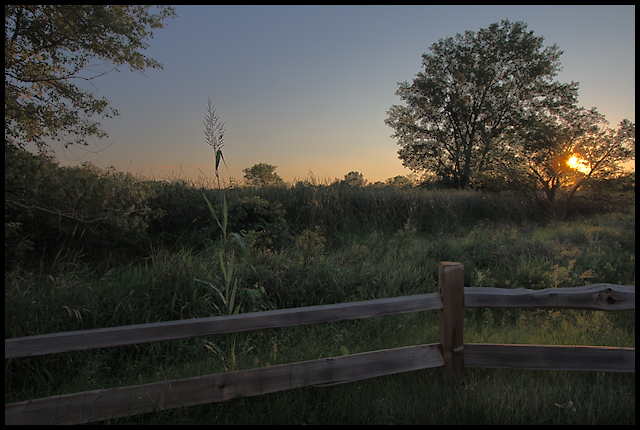
I love the composition. I would have maybe waited until the sun was just under the horizon though. I'm guessing you didn't have a tripod handy when shooting this though (thus F7 and ISO 200). A tripod and a much slower shutter would have been my first choice if I were shooting this.
On my monitor the colors seem a little muted, maybe because it's slightly underexposed? I'm not a PS pro so I can't offer much advice on how to punch them up a little.
I'm not sure if it was intentional, but the photo looks soft. the soft focus does work nice here, but the trees kind of have a blotchy look to them. It makes it look more like a painting, kind of a nice Monet feel though. I would have scored it a 6.
Why the 5.4? I'd guess it was a combo of the soft focus/painting feel which is not always popular here and the muted colors.
You were probably trying not to blow out the sun, however the foreground seems to need a touch more light to bring out the detail of the fence, and possibley enhance the colour a bit.
Not a bad composition. It's the exposure that concerns me. It's not quite a silhouette and that makes it harder to bring out much detail. Also, this photo does not scream "pastel" for the particular challenge.
I thought this photo was amazing. I gave it a 10 during voting. I like everything about this picture. The composition is fantastic, and I love that the sun is there. Great job IMO. ;)
Personally, (you asked for feedback in forum thread), I think it's a little busy and that busy-ness (word?) gives it a snapshot kinda feel. I'm also thinking that the foreground is almost lightened a bit too much - seems unnatural given the location of the sun. Could be this monitor at work, but the foreground looks like it could use a little more contrast. All of the above is JMO of course. ;^)





 Add photograph to your favorites
 Add photographer to your favorites

 Photographer found comment helpful.


