Author Thread Comments Made During the Challenge
Post actions
Post actions
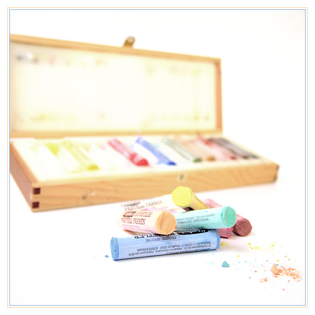
Nice composition, but I would have preferred it a little more rotated to the right (ie the box more on the left and the "pencils" more on the right)
Post actions
Post actions
Plain, simple, and definately pastel. It all works together for a pleasing picture.
Post actions
Blown highlights. Needs some pp.
Post actions
I like this composition, but seems slightly overexposed.
Post actions
I really like the pastels in the foreground and the dust. needs more dof and the box turned.
Post actions
i would have maybe done the box more in focus. but i still like the idea!
Post actions
Nice colours, I like the OOF box in the background. It seems a little overexposed but I suppose that adds to the feeling of light colours, so it's not too bad.
Post actions
Cool stock shot! Nice use of color.
Post actions
I think this is a little too blown out.
Post actions
Very cool, nice composition
Post actions
the composition is good, but it seems overexposed to me
Post actions
a nice composition but imo the angle and focal point don't work to their full potential, if you wanted the box blurred it should have been positioned so you couldn't see inside, this position invites you to look but it's blurred - hope this makes sense (6)
Post actions
I like the colours and softness, the crumbs of pastels, the only thing that seems a little off is that the box looks very awkward, tilted at a strange angle
Post actions
I can see this doing well I like it alot
Post actions
Nice idea but OWIE...my eyes! The white is really bright which makes it difficult to look at.






 Add photograph to your favorites
 Add photographer to your favorites


 Photographer found comment helpful.


