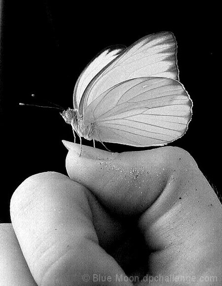
A butterfly from mexico that agreed to stay on my thumb. The lighting is from a hotel window and the background is actually my bathing suit. The grains on my thumb are sand...I was covered in sand the whole time I was there and didn't realize it was on me until after I took the shot. I could get rid of it, but I don't think it's really that distracting.
For people wondering what color the butterfly was...it was white. Boring white with a slightly pale-yellow tint. However it's antennae tips were bright seafoam-green, which I wish I had kept in the shot. The reason why I chose black and white instead of color was because my hand looked disgustingly pink when I tried to up the color. Thank you for all the comments, I am happy with how this one did in the challenge; not bad considering how many entries there were!
Statistics
Place: 243 out of 684 Avg (all users): 5.8346 Avg (commenters): 6.6000 Avg (participants): 5.8762 Avg (non-participants): 5.6731 Views since voting: 1288 Views during voting: 336 Votes: 254 Comments: 18 Favorites: 4 (view)
I love the tones and textures of this (except for the grid). I have to disagree with a lot of your commenters though -- I don't think the image would work near as well without the sand.
The eye is pulled to strong contrasts, first to the bright area of the wings against the deep black of the background, but then following the lines and textures of the wings and legs down to your thumb. Here my eye is pulled toward the dark area between light thumb and fingers -- but is kept from going in by the barrier line of sand that gently lifts my eyes back up to the butterfly. Intentional or not, the sand works for me.
I like the sharp defintion against the background. I have no idea what color this creature is, but it sure makes me want color in this shot. There definetly is some sort of pattern or grid across the image. Could be an artifact of a filter used in processing. Looks almost like a screen. I find the sand a little bit distracting, which would be more minimized in a color view. Littlegett's suggestion of only the butterfly in color is a great idea.
Focus, depth of field, lighting, brightness, and contrast are all very well done.
Very cute little guy. Don't know what the colours are like but might be better. Or maybe hand in b/w and the little friend in colour make him Pop! more.
Ironically, this otherwise great photo is ruined by its unnatural texture: there's this grid pattern all over it, which I'm guessing is a compression artifact. Your file is just over 100KB, but the limit for this challenge was 200KB, so you didn't need to compress nearly this much.
-SUPER COOL!!!
-Pefect lighting
-Not sure I love the title... just mentioning that... not scoring down for it.
-I love the contrast of the moth against the black background.
-Score: 8
Interesting title as I don't see many textures here - smooth fingers, smooth butterfly - the that's just my eye. It's a good photo but i'm just not sure about the title (didn't score you lower because of).







 Add photograph to your favorites
 Add photographer to your favorites

 Photographer found comment helpful.


