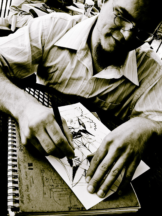
I only took photos once during the challenge period, but I got some interesting stuff. This is my good friend Lucien. He and I went to college together and have attended umpteen dork-rock concerts together, namely Yes concerts. Anyway, he is an avid drawer and is working on a comic book with another one of his friends. While what he is working on here isn't part of that comic, I do believe that the comic was the topic of conversation at this point.
The photo was shot in macro mode, which on my point & shoot gives fairly good results, notably with enhanced depth of field. Processing involved BradP's USM action and an action of my own that basically makes a burnt quadtone. After some additional level and curve adjustments, it was ready. No cropping, which is nice. Always good to save a step here and there, right?
Statistics
Place: 311 out of 684 Avg (all users): 5.6617 Avg (commenters): 7.9375 Avg (participants): 5.6274 Avg (non-participants): 5.7963 Views since voting: 944 Views during voting: 352 Votes: 266 Comments: 22 Favorites: 4 (view)
very interesting composition! it's not very often to see a bust portrait that is to dynamic--i think it's the angle and the fact that the composition is open on all sides; and, probably, also the high contrast, together with all the diagonals... i also think it's great that you captured so much of your subject, both in his face and in his creation. good job. keep it up! (if i were a member and could vote, this would be a definite 10!)
This is an effective portrait. It shows this man and also his work. I like the contrasty, grainy feel to it, adding a journalistic, realistic feel to things.
this is how you do a portrait. The photo becomes the subject. You become the sketch artist, working with fierce shapes of black, scratchy fields of gray, harsh lines and shapes. You sketch the artist and his work, the artist creating his work, and the artist becoming his work (it looks as though he's falling into his own picture!). Portraiting doesn't get better than this, and that includes the pizza and the soda. 10
I like the off center kilter presentation of this portrait shot. It makes the photo interesting and appealing AND it really calls attention to his hands. The photo is not only visually interesting because of the composition but because you show us the artist at work. It is as if we are sitting accross the table watching him as he sketchs. His hands and the sketch dominate 50% of the photo and the foreground which makes them more of the focus of attention - now that is a great composition choice for it really draws us into the photo. My only critique is that too much of his face is lost in shadow. I would have liked to have also been able to see the concentration/expression on the artist face more.
hmm, i like the angle, although i'm not sure how well this high contrast is working for me. i would have liked to see some more of his face as he seems to be an interesting character.
The angle and the toning work well for this shot. The bit of dark under his arm is unfortunate but really doesn't detract very much from this portrait.
The personal nature of notebooks and sketchbooks always fascinates me. To have the author in the same image as his creations is a double plus. I think this is excellent work.







 Add photograph to your favorites
 Add photographer to your favorites

 Photographer found comment helpful.


