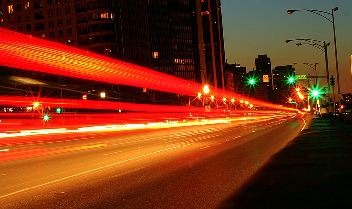
Straightening the picture would help it along quite a lot - the buildings and lamp posts are leaning. Other than that this "night light / light streak" theme is done so often that if it's not done uniquely or really well, it's just uninteresting.
Composition: 4 - The tilted effect could work if it was MORE tilted, but at the moment its not enough to really add drama, it just looks.... a bit wonkey.
Technical: 4 - Nice stars on the lights, but the sky and general overall colours look a bit drab
Creativity: 4 - The vanishing point is good, but there is no real subject matter to add any interest.
Appeal: 4







 Add photograph to your favorites
 Add photographer to your favorites


 Photographer found comment helpful.


