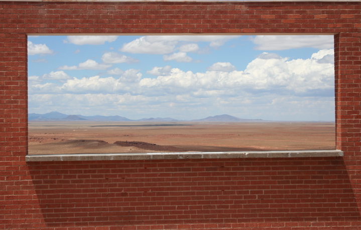
Well in accordance with challenge rules it best be a window L()L. Nice image/finde, just don't care for the distortion Might look better if it was more attentional or maybe not there.
Good idea, but it looks as if it's tilting to the left. (Look at the horizontal lines of the bricks.) Maybe if you had taken this head-on you could have avoided this. It's a distractin. Nice view through the window, though.
Technical: the contrast could be a little more, the coloring is good, i think it could be a little more saturated though
Creativity: i really like the idea, i like how the composition is...not too centered...
Score: 8
This photo would be better if it were taken from directly straight on, not at an angle. The top is level, but the bottom is not. I may have skewed it in PS to make it less distracting
this is amazing. if you did some free transform to pull down the right edge, this would be perfect. not taking away from it, hope that doesn't offend. this really is a great image. good luck! 6





 Add photograph to your favorites
 Add photographer to your favorites


 Photographer found comment helpful.


