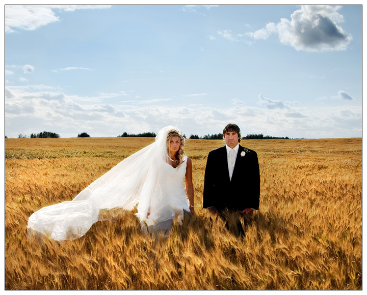
Original title was "Field of Broken Dreams", but that would have been pandering to the masses.
For the record, Jay and Troy are two of the happiest people I know...they love each other to bits and the wedding day was a camplete riot, from start to finish. If you wanna see the slideshow of the rest of the day it's here --> //www.peter-marlin.com/Video%20Files/jandtroy.wmv (it's a huge file, be patient)
This is supposed to give you a dissonant feeling when you look at it. As a few people figured out, this type of image (which i've been doing a lot at weddings lately) is loosely inspired by American Gothic. Everything from the lighting to their poses to the distance between them, their expressions...all of it is off. Intentionally.
So yeah. anyway. I was surprised at how many people commented that it wasn't a good wedding photo because they didn't look happy. Satire apparently isn't recognized around here too much. I suppose I could make nothing but happy smiling Sears portraits like everyone else, but then I'd be...just like everyone else.
n'uh uh. ain't gonna happen.
P
ps thanks to those who got it.
Statistics
Place: 39 out of 684 Avg (all users): 6.4906 Avg (commenters): 7.4468 Avg (participants): 6.4231 Avg (non-participants): 6.7368 Views since voting: 2956 Views during voting: 464 Votes: 265 Comments: 77 Favorites: 21 (view)
Hi again,
I looked at the VIDEO/SLIDE SHOW and I have to tell you that I really didn't think I would bother to watch pictures from a strangers wedding but you sure made it interresting.
What a Genius you are. Perfect photos and editing!
Total time of over 23 minutes but It was fun for me!
Again, congratulations on a perfect Wedding memories for the couple.
ok, I just kept thinking about this photo and i very seldom do that.I think what intrigues me the most is my eyes see the traditional black and white attire leading me to assume that the traditional pose will follow,not so here. The space between this couple speaks volumes here and begs the viewer to take another look.
very,very well done!
Hahahaa..this was so funny, one of my faves, it was nice to see something creative and different! I hate boring wedding pictures, things like this are so much better! The scenery is also perfect btw :)
i "got it". But one doesn't necessarily have to read distance. I almost read the basics which are thrust in your face: man/woman ... future/present ... black/white ...beautiful field=hopes/ 6" seperation=marriage is a challenge. But then again, the image is simply pleasant, yet quirky, but not to the point of nuisance.
Its hard to believe how many people have such preconceptions of 'wedding' photos (happy couple?) and the belief that this is a wedding photo in the first place. The image is great as is, voters just don't know how to get out of their box.
You know, I want to hate this shot but it is so compelling - awesome in fact. Possibly the first wedding shot I have seen that adds in the notion of future prediction, of what will be, as well as what is.
ok..well now I need to get a date, fall in love and get married Just so I can get Pedro to take an awesome wedding pic like this for me :-)
Very cool work, u rawk!
i'm so surprised this didn't finish higher. i can't even begin to describe how perfect this shot is. it should have placed in the top 10, at the very least...top 3 if it had been up to me.
I love that you are throwing the American Gothic stance into your weddings now.. if for no other reason than to create a bit of controversy.. It makes people stop think and look. Which represents to me, the beauty of Art and you create it so deliciously.
L()L This is funny, they look so grumpy with each other, like they don't like each other, but the symblance is they were just married I would assume. L()L, bunny image. Sky needs more blue but the rest seems too work well. Not sure whos dream it would be with those mean looks though L()L
Wow, what a wildly different concept for a wedding photograph. Amazing color tones in this very cool photo. This reminds me so much of the American Gothic painting. I also find the grain patterns and detail very fascinating.
I like everything about this photo except the look on their faces.
It's a nice idea to shoot this in a field like this, in many cultures grain is a symbol of fertility.
The expression on their faces says "we don't want to be here"! the setting is idyllic and the capture and work is good but but...they're not happy..7 anyways
hmm they don't really look very happy. Love this idea, but not sure about the bride and groom. I can see this shot with a nice woman, with a long scar or something like that. still, I like the image.
Very interesting location for a wedding shot, I like it. The couple doesn't seem very interested in each other however. The reason I chose to comment on this photo out of the numerous entries is because of the bright skies in comparison to the rest of the image. Very difficult to reconcile the differences in brightness, you adjust for one and you lose the other. My suggestion is to use a graduated neutral density filter when you take the shot, probably a hard edge filter in this case. It will help to even out the differences in brightness to more manageable levels. Having more detail in the clouds and a deeper blue to the skies would have greatly benefitted this image. Other that the filter that I have alreadly mentioned, a polarizing filter would also help if you didn't already use one for this shot. - 7
I like the idea of the shot alot. Wonder if a gradiant ND filter would have helped darken the sky a little, also not sure if I like the horizon running through the brides head.
Love the way the sunlight plays on the wheat field for as it sways in the wind it looks like it is alight with a golden fire. Lighting is wonderful in this for it illuminates the bride & groom wonderfully. The bride and groom that stand there don't look too happy and it makes me wonder why - their expressions appear neutral. Given that this represents their wedding day I would think that they would at least be wearing a smile or be holding hands in the composition. Instead they stand apart and it makes me think that they are not at all close to each other - in fact, the stance and neutral expressions communicate an uncomfortablness between them. I am not sure that is what you wanted to communicate in this photo given the positive imagery of the title. One last insight is that that you could crop off about 20% off the top for there is too much sky/negative space that does nothing for the composition overall. A closer crop helps keep the attention more tightly focused on the main subjects.
Love the location and the idea. Maybe bump up the blues in the sky a bit for better color. The horizon cutting into their heads is distracting. Don't know the best way to fix that.
I really like what you were going for but it needs someting, pitch forks or for them to be touching. This unattached unemotional shot may be what you were going for but for me I like emotive shots or at least shots where their hands are not just hanging.
Very cool idea and well executed. I love the textures of the wheat. Your colors are great and you did a good job keeping detail ni the white dress. I wish the horizon didn't cut through their heads, especially with the three line back there. Maybe a lower camera position would have worked better, putting more wheat in the foreground and having their head and shoulders above the horizon.
Wow, I think in a way, there are so many things wrong here - the couple are so sad, there is a physical split/distance between them and they both look super uncomfortable, the guy is very rigid too, almost like a scarecrow. But as a piece of artwork, it's great - I've been looking at this photo for a while now just trying to guess whats wrong and what the story is behind the shot. In terms of technical details, not much to say, except maybe a polarizer would've given you a nice sky, I don't know if that would fit the feel of the image. I think that the slightly washed-out feel is probably better. Good luck!
Gosh is it me or do those two look utterly miserable? Great composition and idea but the expressions on their faces just do not compute with your title.
You photo stopped me in my viting tracks. The personae have a gravid sort of look. Wheat fields are usually a metaphor of life and sustenance. It's an interesting juxtaposition.
They look so unhappy! I like how the plants (wheat?) are blurry while they're sharper - adds a fantasy feel. A tighter crop on top, like just below the cloud on the upper right, would've kept my eye from wandering off the couple and emphasized the field in the title.
"American Gothic" with an odd twist. Pretty cool! Definitely like it. Glad oyu didn't hyper saturate the sky - would have lost something for me at least. Well done! 8
What immediately caught my attention here is the odd dissociation and seperation/space between this just married bride and groom with the stark expression on their faces. It's as if there's no unity between them and yet it's a wedding picture. It's the exact opposite of the sense of romance and love one would expect a picture of a newly wed couple to show. Makes one wonder what's going on there.
This is a really really fantastic wedding portrait. I love the fact that instead of smiling, they both have blank expressions on their faces as if they were both like "WTF was I thinking?!?" Great job.
Fabulous concept, and I love the irony of the dour expressions in this 'field of dreams'. This image is just two details away from a 10: The cloud in the upper right corner pulls the eye away from the subjects, and the horizon going through the heads just doesn't work for me (higher vantage point with their heads entirely below the horizon would have been best).
this is one of the fines wedding photographs i have ever seen; these people are so lucky to have this to keep! everything is completely perfect; their pose being not too lovey, the mix of colours is glorious, the light and shadows on the field really gives a sense of swaying and wind, the gorgeous sky... one of my top favourites i've seen so far in the challenge. 10.
This is a GREAT photo with one KEY mistake ... what your horizons. The Horizon through the head will kill a shot every time. Also the sky could use a little saturation ... did you use a polarizer? Great effort.
The couple standing apart makes the shot feel a little odd or contrived - I think people just get used to seeing wedding couples holding hands or really close together, great shot only other thing I would like to have seen is a polarized sky to almost get the opposites from the color wheel blues on yellows ... Good luck 8
I like the pose and the facial expression a very unique wedding picture. I wish the focus had been a little sharper on the subjects but I love the soft focus on the wheat. Good luck.
this is superbly creative and I hope it rocks when it comes to score...it tells a story and the composition and colour, wow! it is so interesting that I am looking at it over and over 9
This one held my attention for quite some time. Very interesting and intriguing image. They don't look very happy :-) I'm probably missing some symbolism or meaning here. I'll come back and look more later! Hope you have some info in the comments section post-challenge. It's definitely got me thinking. I like that in an image very much....so....well done!
Ironically, I just watched the film "Dandelion", which has many elements very similar to your photo here. I'm not a member, so I can't vote, but I think this shot is great. I personally prefer black borders, but this one works out great.






 Add photograph to your favorites
 Add photographer to your favorites

 Photographer found comment helpful.


