I know I'm missing something that everyone else is getting with this shot. Can't seem to figure out what the subject is suppose to be, then numerals or the chains?
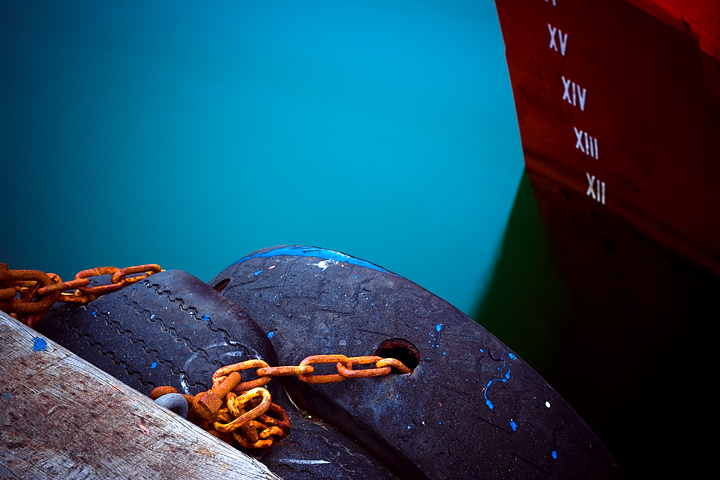
stellar color and composition, and I like the title to even pull your attention off the photo. I also like the lines of the chains lead the eye to the numbers. I wouldn't change a thing. 10
Oh ho-ho-ho! Love the visual impact of this and how well it plays into the current challenge title of (Free Study) XII. The mark on the ship shows XII just above the water line which matches the Free Study. Also the title of the piece is XI, which tells us what we don't see - we see from the Mark lines that the next one down from XII will be XI. I love how you are playing with the visual here and tying it to the challenge title. However, I think the composition needs a little improving to strengthen your presentation. First off, I love the hues of the blue of the water and the red of the ship. I really think you could make those two elements the main focus of your photo. Those colors could really make the photo visually 'pop' but as it is here they are lost in the composition. The red of the ship (and those white mark numbers) occupy only 20% of the composition. A tighter crop or even a square crop would make the water color and the ship the main stars of the composition. As an added bonus, calling more attention to the mark numbers will only strengthen the visual appeal of the image. Leaving in the weatherbeaten wood of the dock does not add visual appeal. Actually it detracts because it adds nothing to the composition overall & the worn color does not complement the bolder hues seen here. Even if you did not want to do that quite of a tight crop, cropping out a third on the left side will still leave a strong visual appeal. Plus, it would add just one other element of interest with the tires and the colorful orange chains.
love the hyper unreal tones of the colours. and the glass looking smoothness of the turquoise water is ttally gorgeous. to be honest, the graininess of the timber doesn't really fit in. or maybe it does. not sure now, but i think it's actually a good complimentary contrast. er. i wish the depth of field was greater; the slight softness of the numbers doesn't quite go and sticks out a bit. still, as a piece of visual abstract art, it's really effective and wall mountable. 9.
this image is stunning...there are so many complementary colours and textures and there are interesting things all over the image...the composition is superb....you are up against some stiff competition in this challenge, so good luck and I hope this does well
Well, it's 'Free Study XII' so I'm curious as to why you titled it XI? It's a nice capture and a good find. The dabs of blue paint are a little distracting to me. I really like the color of the water.
I see the water (i assume its water) as being too processed. It doesn't look real to me. I guess overall I'm not a fan of these colors in this photo. 5
Jahá, mér finnst persónulega að þú hefðir átt að senda myndina með undarlegu myndbygginguna. Þessi er þó ansi fín. Ég fíla hvernig hún er samansett úr mörgum mismunandi hlutum og flötum. Litirnir eru líka æði, minna mig á litina í myndinni með undarlegu myndbyggina. Gangi þér vel.
This is great, love the colors and feel to the image, such a great clear crisp look with the contrast of the smooth water enhanced by a probable long exposure. congrats on a great image.





 Add photograph to your favorites
 Add photographer to your favorites


 Photographer found comment helpful.


