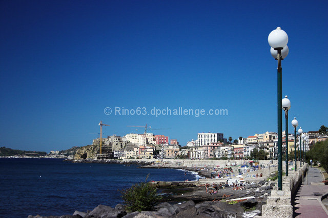
I like the sky. For a featureless sky you did well, adding a little interst to it with the polarizer. I'd also vote to eliminate the white spot in the water. It's too small to see what it is, and winds up being distracting.
What I see here, is two sets of leading lines. The lamp posts take us in one direction, to the right. The shoreline tries to guide us to the left, and a tug of war results. As the viewer, I wind up trying to decide what the real subject is. The buildings are a little soft. A smaller f-stop would help here. The lamps are sharp but lead us almost off teh edge of teh frame, and then we have to cross over them to follow the shoreline and road.
My focus keeps winding up at the construction site near the white and red buildings, which is close to center of the picture.
If you could have gotten a bit to the left of this vantage point, the lamps would have lead the viewer in concert with the shore line and that might help.
Overall this is a pretty picture that I enjoyed looking at. Wish I had one like this in my summer vacation book this year.
I tend to avoid the bottom 1/3rd horizontal line when the sky has no texture. However, I understand the lightpost dictated that this time around. This is something not quite right here and I'm not sure what it is. It might be the angle of the light. I would remove the bright white spot in the middle of the water. This would make a great panoramic if you cropped off the top.
Some voters are going to have a difficult time with finding the ROT's usage in this image as the horizon (buildings) appears near center. I know it's not, but it feels that way. Another thing that may hold this back is the image lacks a clear subject IMO. Good use of a polarizer to add some depth/drama to an otherwise featureless sky. Good luck in the challenge.







 Add photograph to your favorites
 Add photographer to your favorites

 Photographer found comment helpful.


