I know I am going to get murdered with this shot and my choice of editing.
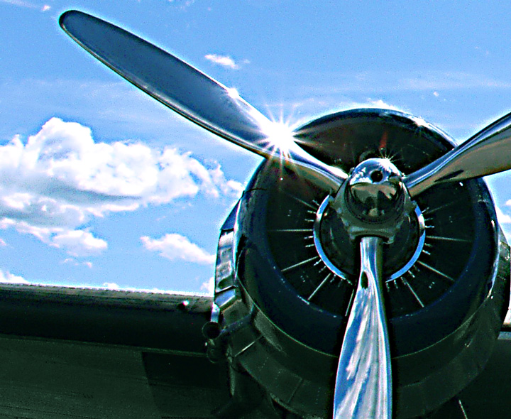
This a WW II era Douglas C-47 (a military version of a DC-3). Basically I was going for a shot that looked a bit more like WW II period color photography hence the grainy dull color look. Cropped, adj hue and sat in specific colors, color balance, levels, unsharpen mask.
I have included the original unedited of this here. Looking at now I guess I shouldn't have gone quite so radical in my PP. Live and learn(?)
Statistics
Place: 646 out of 684 Avg (all users): 4.4414 Avg (commenters): 5.0000 Avg (participants): 4.3980 Avg (non-participants): 4.6000 Views since voting: 863 Views during voting: 334 Votes: 256 Comments: 25 Favorites: 1 (view)
The high contrast and nise in this really hurts this overall. The halo around the prop & wing is distracting - perhaps a bit too much shadow/highlight adjustments? Maybe as it is, would have been better in black & white, as the grain(noise) works better in that medium than in color.
it's really hard to bond with this photograph. the level of over-sharpening, the unattractively grainy noise and the halo effect around everything really puts you off a bit. it's a pity as i would imagine that without the sharpening (if it's blurry, make it more so as a style statment!) the chrome props would be probably be super smooth and lovely (especially with the glare spot from the sun). there is also a lack of context; it's like just photographing a nose in a portrait. i want to know what sort of plane it is, what sort of character it has, how it might have lived, how old is it really, is it civil or military?? it's impossible to tell anything about this from this sort of crop, and i don't think it's arty enough to be considered abstract. sorry.
edit just to add the thumbnail actually looked gorgeously slick, shiny and smooth - if you managed to maintain the appearance of the thumbnail, i think the composition issues i had would be less of an issue because overall this would have been more appealing and more successful.
A great subject, and a good composition. Looks very grainy or something though. Don't know if it is intentional, but just doesn't seem to be working. Comes across looking either overprocessed, oversharpened or possibly over aggressive cropping.
This looks a bit oversharpened, and could benefit from Neat Image for the grain (unless you were going for the grainy look, to make the photo seem older, in which case I would recommend slightly heavier and monochromatic grain.)
Fantastic composition but the image quality is suffering quite a bit - I wonder if it's from compression when you uploaded? The sunshine on the propeller is a nice touch.
I like the angle you chose for this shot, and the reflections off the propeller blades. There does seem to be a bit of color noise/grain and a bit of haloing.




 Add photograph to your favorites
 Add photographer to your favorites


 Photographer found comment helpful.


