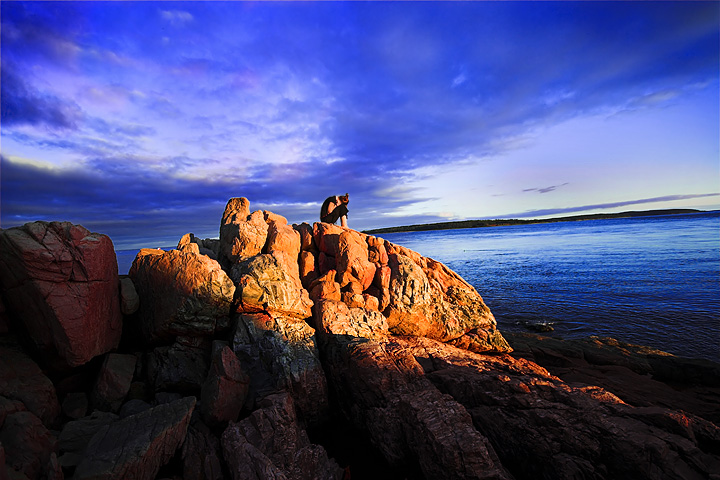
This was shot when I was on vacation in Maine, in Akadia national Park. D was relaxing on the rock while I was trying to get a fun picture of the sun setting and so I snapped one picture of her for fun... It ended up being my favourite.
Statistics
Place: 168 out of 684 Avg (all users): 6.0000 Avg (commenters): 6.7600 Avg (participants): 6.0051 Avg (non-participants): 5.9811 Views since voting: 1197 Views during voting: 372 Votes: 250 Comments: 27 Favorites: 5 (view)
The horizontal slant is disconcerting. The colors are quite vivid, actually may be a bit oversaturated. This image could be stronger also with a shift in composition by cropping about 25% off the left side and some off the bottom as well to get the subject off-center.
Technical: love the lighting, contrast and coloring...
Creativity: i wish she wasn't so centered...but the way you capture the light only there!!!! awesome
Score: 10 and adding to faves!
-GORGEOUS SETTING!!
-Beautiful colors!
-Horizon is tilted
-I would have definitely cropped this tighter... from shadow on the rock, up and to the right... placing her in a perfect rule of thirds position
-I want to contemplate in a place like that :) :)
-Score: 7
The dramatic lighting and the sky make this a very nice shot. I am one of those, though, that likes horizons to be level so the water doesn't run out of the sea.
Composition: 6 - I think cutting a little off the bottom and left would improve the composition.
Technical: 6 - The shadowy area at the bottom seems a bit dull, but the rest is nice and vibrant and contrasty, if a little soft.
Creativity: 7 - The tilt works well to add a unique perspective, but I think even more of a tilt would look better, to stop it looking like it could be an accident.
Appeal: 6 - A nice photo to look at that holds my interest for a while.
Beautiful work. Love the colour, lines and subject. Tilted horizon by choice? I suspect so, and I personally don't think it harms the composition, but you may have some other die-hard crits tell you different - 10
GREAT VIEW AND COLORS.
The horizon looks tilted, yet it seems to add to the composition.
I would like to have seen the person a little more clearly.
had it not been for the title I could easily have skipped by and missed the contemplator.
Jeeeez. . .what gorgeous lighting. I love photos like this that show scale and perspective by having a tiny little person in it. One of the great ones here for sure!
Great composition. Alone on the barren rock surrounded by the vast and open sea sits a man curled up in contemplation. Yes, I get the sense that he is very alone with his thoughts because in the composition he is small to his surroundings. While that composition choice plays as a strength to creating the mood it also is a weakness. I think that you could have cropped another 20% of the image and captured the same mood. And, the advantage would be that it would have called greater attention to the figure sitting on the rocks - he is a little too lost in his surroundings. The colors are a tad too surreal - the purple & blue hues in the sky and the sea appear to vivid, too unnatural in that they almost take on a supernatural effect.
Great composition and the light is fantastic, but... imo I would have had the model standing or in a different outfit, at first glance she looks like another rock - maybe just me (6)
I have a personal weakness in the form of intolerance for tilted horizons. To me, they give the impression of sloppiness. Sometimes a horizon tilted purposefully will improve a photo. In this case I don't think it does and it's tilted to a minor degree so that I can't tell if it's on purpose, or an error. Otherwise it is a well composed and executed photo. Great color. Gives a sense of drama.







 Add photograph to your favorites
 Add photographer to your favorites


 Photographer found comment helpful.


