Additional comment that was mentioned to me later-on: it may not only be an issue of calibration, but of differing video cards, monitor types, etc.
After contest:
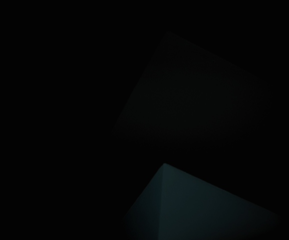
Essentially this is an abstract picture with enough messing around with color hues, shadows, contrast, that sort of thing, until I suddenly had an image I loved. On the monitor I was working with I saw a black screen, with a sort of pyramid at the bottom and a shadow above it in a triangular shape. I saw texture, shadow, depth, and interest. Either way, the very subtle blue tint against a black object was the stuff of creepiness. I worked with it back and forth until it was just right. For me. Of course, not everyone--or anyone necessarily--will have the same reaction I did (obviously), but then there is nothing wrong with abstraction or surrealism.
I still love this piece, and a few commenters did too. I've learned three in this challenge:
1. I learned this when I got home too: not all monitors can see the same thing. But from the comments, some saw exactly what I did and didn't like it anyway. At home, I could not see the lighter shadowy shape above the pyramid.
2. I should do what I enjoy, not what will get me votes. Some of these comments were unconstructive and negative. I assume they were all honest at least. It is difficult because I found the ego getting in the way, especially because I really liked this photo. (This photo, however, did get my first "favorite" listing as well, which did make my ego happy :) )
3. If I really want to win a contest, I need to temper my imagination towards the more literal, or at least something with more contrast. And I have some like that too. It's not a big deal. Like I said, I'm happy, and I don't think there's anything technically wrong here, though I have so much to learn as well. This is a fun community and I look forward to continue my participation and learning.
Unfortunately there is nothing actually camera-technical for me to learn from this particular photo because it is so unusual. This is probably why it is such a poor entry for me.
Well, if you've read this far you must be intrigued in some way. Thanks for your kind attention. Time to get ready for work.
Statistics
Place: 678 out of 684 Avg (all users): 3.3080 Avg (commenters): 3.9600 Avg (participants): 3.2640 Avg (non-participants): 3.4717 Views since voting: 1212 Views during voting: 387 Votes: 250 Comments: 37 Favorites: 2 (view)
I think this pictue is supurb. I didn't vote in this challenge but I would have scored this an 8. I just use a laptop but I can clearly see the picture. Great job.
sorry, but when my monitor was "correctly" calibrated I made a picture too dark for DPC and got blasted, so now I make my monitor too dark! But I gave you a 7 based on the bottom shape alone...
I'm with SkyNevada, I can see the shapes perfectly. But that's most likely because our monitors are calibrated correctly. Oh how I wish folk would ensure the same before attempting to vote....
See, this is what's scary...a lot of people say they can barely see the 2 objects in the photo on their computer screen. To me, they are plainly visible. The lower shape even has a blue-green hue to it. I'm saving it to my favs. Congrats on the 'Brown'...I suspect one is around the corner for me.
I ask myself why.
Why would someone enter this?
Monitor so far off that it looked normal?
Trying for last place? I see 2 pyramids, one barely though, and the title doesn't seem to fit the image, or what little there is viewabale anyway.
I'm still asking myself why. Guess you get my brown ribbon vote.
Unless you are attempting to win the coveted Brown ribbon, I'm afraid I see no merit in this image. Yes -- I see the two lighter wedges, but make no literal or abstract sense out of them. Good luck in the challenge.
i gave this a 9. i'm principally impressed at your bravery and the middle finger directed resolutely in the face of conformity. sadly, i suspect this might not ribbon. BUT, it is a great abstract image. the use of negative space and having such a barely illuminated subject works artistically for me. and the title actually adds an extra dimension, and suits it very well. it's simple, yet almost haunting. i find it quite inspiring.
I enjoy this almost as much for its sheer contrast to the rest of these images as for itself. Can't imagine I'll come back to it much, but it breaks up the show nicely.
I am not sure what I am supposed to see here because the image is too dark to make out any details aside from a solid black with a 'hint' at a shape of a corner of a box....Hmmm, mayhap, and I say mayhap, that that is the point. The name of your composition is Creep - maybe because it is because it is just the hint of a shape 'creeping' in on a solid black background. It creeps in the darkness and barely shows us a hint of it's existance. If this was your aim for the composition than it works, but only with a very small crowd who will sit and try to figure out what the artist's reason is for creating such a composition. For most it is just too abstract and most may just miss the point entirely. If this was not your aim then the image is way too dark for most of us to view and you need to either expose the image properly when you snape the picture OR play around with Levels, Brightness & Contrast to make your image more visible.
Oh my. This is a very daring photo on your part, since it does require that the viewer have a very well calibrated monitor. I do hope for your sake that I am wrong, but your score might suffer because of this. Good luck






 Add photograph to your favorites
 Add photographer to your favorites


 Photographer found comment helpful.


