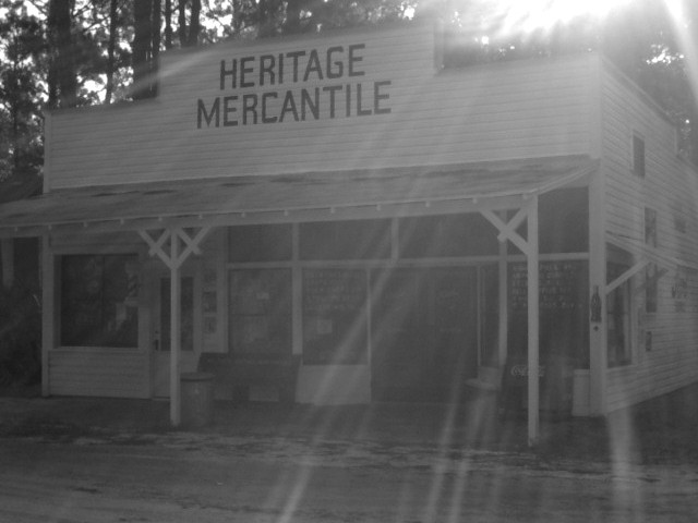
though I normally like sunbeams, i can't decide if this adds or detracts from this picture. It does seem to give it an ethereal feel. I think it needs to be cropped more on the right, and less on the left, but that's just my opinion. karmat
Generally I like the pictrue a lot. The sun shining in from the top is kind of cool but I think it's a pity that therefore the entrance of the house is not as well lit and sharp as it could be.
i love the statement this makes, and the streaming sun. might try moving so that the sun is at least partially covered so the building isnt quite as underexposed. good job! mag99
I like this photograph quite a bit.. the subject is nice and I actually like the sun flares, but the bright flares are a little too hot. They are eating up the contrast in the rest of the image... - jmsetzler
I know the sun rays were on purpose and I like them. I hope you don't get to roasted over them! The building itself is a bit overshadowed by the sun light. I like this idea alot, but the image lacks clarity (I think due to the above issues). If this were an idea only site, you'd get a 10 from me, but 8 is the best I can go with the photo issues. Swash
great idea. almost great image. unfortuately, i don't know how to go about crisping up the mercantile while preserving the wonderful light. i wish you great comments so that you might learn. you have a wonderful eye.
Small town corporate. Interesting take. The sun rays are a bit overpowering, although their presence is welcome in a shot like this - just with a little less intensity.
I love the old fashioned feel of this photo, not just the subject, or the use of black and white, but also the sight over exposure as though its a photo that had faded with time. Great job. BAMartin
This is more "anti-Corporate World"! I like the b&w. The amount of sunspot glare is just a little bit TOO much for my taste. Compostition is somewhat uninspiring.
I like the B&W to underscore the Old Time idea. Don't like the harsh sun light that washes out the top right and creates those exaggerated and distracting lines over the image. Would have cropped out the side of the building too to give more emphasis on the Heritage Mercantile, both old, pre-corporate ideas. Am sure you made this shot when out on a drive. Too bad you couldn't take it early in the morning or before dusk when the light wouldn't have been so bad.
Nice concept but the sun flare washes out the photo and generally distracts from the photo. At a different time of day or under different lighting conditions this would have been an excellent shot. -ClubJuggle







 Add photograph to your favorites
 Add photographer to your favorites


