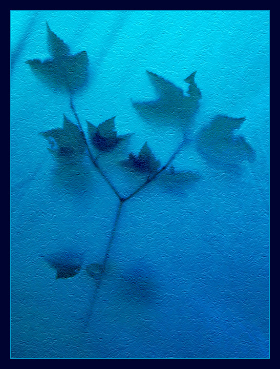
I was camping with friends, and this is what I saw when I woke up in the morning in my tent.
It's a tiny maple tree leaning against the fly of our tent.
Postprocessing:
1. Crop from much larger image and resized.
2. Colour adjustment through levels, hue & saturation, and selective colour.
3. Clone out softly the few fabric crumples, just in semiopaque layer to leave them slightly showing.
4. Doge and burn for more dramatic effect.
5. Added tiny bit of grain to the whole image.
6. Added light texture filter.
7. Sharpened.
Statistics
Place: 148 out of 684 Avg (all users): 6.0398 Avg (commenters): 7.2381 Avg (participants): 5.9444 Avg (non-participants): 6.3962 Views since voting: 1574 Views during voting: 380 Votes: 251 Comments: 25 Favorites: 9 (view)
Excellent photograph! Even more impressive once you find out how it was done.
Color, saturation, hue, lighting, focus, depth of field are all done quite well. The texture seems to be distracting for some, and a plus for others. I find it a tiny bit distracting, depending where in the frame I'm looking, and at the same time think the picture would not be as good without it. (Lots of help that is, I'm sure.) I guess I would like the texture better if it were just a little less pronounced. But if it were gone, then it would just look like a blurry picture. After sitting here squinting at the picture, barely visible texture and keeping the rippled shadows in the fabric, would be really appealing to me.
As is, it is a very effective photo and communicates well the message of the photographer.
I really like this shot. I thought it was a back-lite branch behind some type of obscured/smokey glass. Very clean and simple. This would have done great in the Zen Photography challenge!
this might be just as formulaic as a bee on a flower shot, but I just can't resist this formula. It is so spiritual, mystical, mysterious. It seems to get to the very essence of photography. 9
I actually quite like the treatment here, although this looks far more like digital art than photography. Might have been improved if one could see a bit more of detail in the leaves though.
Composition: 7 - In this case the centeredness works I think.
Technical: 6 - Nice appealing colour gradient, and teh silhouette looks good. I'm not sure if the texture is natural or post processed in, but either way I find it a little distracting. The whole thing could be a little sharper too.
Creativity: 7 - Nice idea and executed well :)
Appeal: 6






 Add photograph to your favorites
 Add photographer to your favorites

 Photographer found comment helpful.


